Abstract Art Quality Evaluator
Use this checklist to move beyond "What does it look like?" and assess the technical and emotional quality of an abstract piece.
Evaluation Criteria
Does the artwork feel stable? Does your eye slide off one edge, or dance around naturally?
Are colors intentional? Do they create depth/mood, or do they clash randomly?
Does the surface show energy/process? Or is it flat/accidental?
Can you trace a visual journey? Are elements interacting dynamically?
Did it reveal new details over time, or did you get bored quickly?
Your Verdict
Awaiting Input
Select options above to generate a critique summary.
Complete the checklist to see how strong this piece is according to standard abstract art principles.
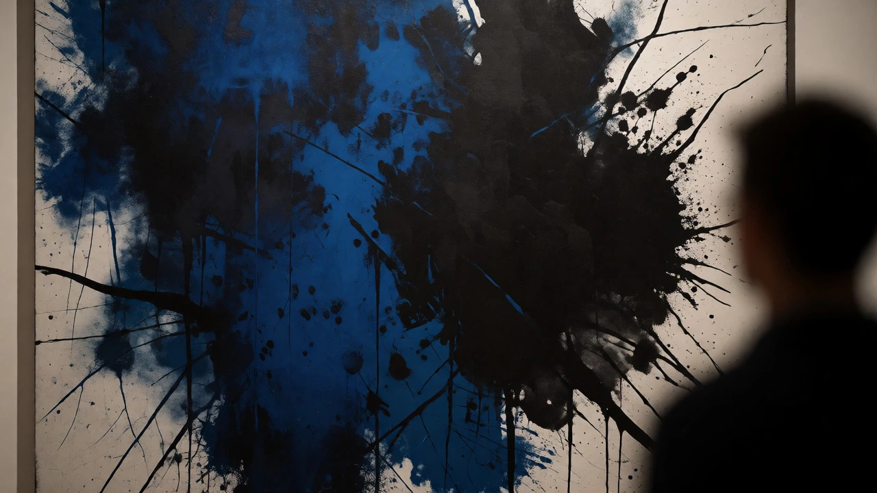
You stand in front of a canvas. It’s just splashes of blue and black. Maybe a few jagged lines. Your friend says it’s a masterpiece worth $50,000. You feel like you’re missing something obvious. Is it actually good? Or is the emperor wearing no clothes?
This is the most common frustration with Abstract Art. Unlike a landscape painting where you can check if the tree looks like a tree, abstract work has no reference point. So how do you judge quality? The answer isn't about finding hidden objects. It's about analyzing composition, emotional resonance, and technical execution. Here is how to cut through the noise.
Forget "What Does It Look Like?"
The biggest mistake people make is trying to find a subject. If you ask "what is this?", you are using the wrong tool for the job. Abstract art isn't trying to mimic reality. It’s trying to evoke a feeling or explore pure form.
Think of music. When you listen to a jazz solo, you don't ask "what song is this?" You ask "does this sound interesting?" Abstract art works the same way. Shift your question from "what is it?" to "how does it make me feel?" or "why did the artist put that red dot there?" This mental switch opens up the actual criteria for evaluation.
Check the Visual Balance
Good abstract art feels stable, even if it looks chaotic. This is called visual balance. Imagine a scale. Every mark, color, and shape has weight. Dark colors feel heavier than light ones. Large shapes feel heavier than small ones. Sharp angles feel more active than soft curves.
A poorly made abstract piece often feels lopsided. Your eye keeps sliding off the edge because one side is too heavy. Great artists manipulate these weights so your eye dances around the canvas without getting stuck. Try this test: squint at the artwork until details blur. Do the dark and light areas feel evenly distributed? If your eyes keep pulling to one corner, the composition might be unbalanced.
Analyze Color Harmony and Contrast
Color Theory is the backbone of successful abstraction. Artists use color to create depth, movement, and mood. In bad abstract art, colors often clash randomly or look muddy. In good art, every hue serves a purpose.
Look for intentional relationships between colors. Are they complementary (opposites on the color wheel) to create vibration? Are they analogous (neighbors) to create calm? High-quality work shows control over saturation and value. Even if the palette is wild, there is usually a logic to it. For example, a splash of bright yellow might draw your eye to a specific focal point, while muted grays push other elements into the background. If the colors feel random, the artist likely lacked direction.
Evaluate Texture and Materiality
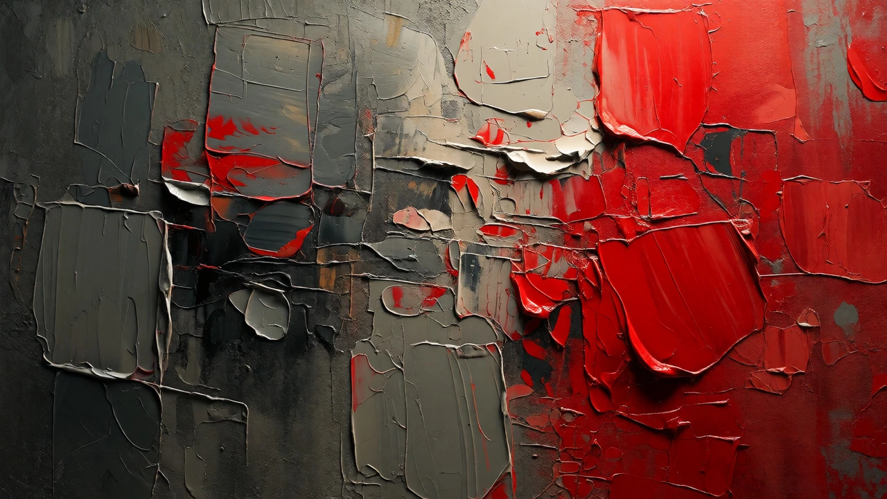
Paint is physical. How it sits on the canvas matters. Did the artist thin the paint to washes, or build it up with thick impasto? Does the surface catch light differently across the piece?
Texture adds time and process to the work. You can see the energy of the brushstroke. Fast, aggressive strokes convey urgency. Slow, blended layers suggest contemplation. Bad abstract art often hides behind uniform flatness or sloppy drips that look accidental rather than controlled. Good art uses texture to guide your hand and eye. Run your gaze along the ridges of paint. Do they lead you somewhere, or do they just stop abruptly?
Assess Composition and Flow
Composition is the arrangement of elements. In abstract art, this is less about symmetry and more about rhythm. Think of it like a dance. Elements should interact. Shapes should overlap, touch, or leave deliberate gaps.
Trace the movement with your finger (in the air). Does your eye follow a path? A strong composition creates a "visual journey." It might start in the bottom left, move diagonally to the top right, loop back, and settle in the center. Weak compositions have dead zones where nothing happens, or chaotic zones where everything competes for attention without hierarchy. If you can’t trace a flow, the piece lacks structural integrity.
Consider the Artist's Intent and Consistency
Context changes everything. An artist who paints abstractly for ten years develops a language. Their marks become recognizable. This consistency builds trust. If an artist suddenly produces a messy, unstructured piece after years of precise geometric abstraction, ask why. Is it a break in style, or a lack of skill?
Research the artist. Read their statement. Understanding their goal helps you judge success. If their goal was "to capture the chaos of urban traffic," then jagged lines and neon colors make sense. If their goal was "serenity," those same elements might fail. Intent provides the yardstick for measurement.
Does It Hold Your Attention?
This is the ultimate test. Stand in front of the piece for two full minutes. No phone. No talking. Just look.
Bad art gets boring quickly. You scan it once and walk away. Good art reveals new details over time. You notice a subtle shift in tone you missed before. You see a connection between two shapes that wasn't obvious initially. Complexity rewards patience. If the piece feels shallow after thirty seconds, it probably is. Great abstract art has layers-literal layers of paint and metaphorical layers of meaning.
| Criterion | Signs of Strong Work | Signs of Weak Work |
|---|---|---|
| Balance | Eye moves naturally; no single area dominates unintentionally. | Feels lopsided; eye slides off edges. |
| Color | Intentional harmony or contrast; clear focal points. | Muddy tones; random clashes; no hierarchy. |
| Texture | Varied surfaces that enhance depth and emotion. | Uniform flatness or accidental-looking drips. |
| Composition | Clear visual flow; dynamic interaction of shapes. | Static layout; disconnected elements. |
| Engagement | Reveals new details over time; holds attention. | Becomes boring quickly; superficial. |
Common Pitfalls to Avoid
Don't confuse complexity with quality. A simple Rothko color field painting can be profound, while a busy Jackson Pollock drip painting can be mediocre if the rhythm fails. Simplicity requires immense control.
Also, beware of "museum hype." Sometimes we think art is good because it’s expensive or famous. That’s social proof, not aesthetic judgment. Trust your own perception first. If you don't connect with it, that's valid. Art is subjective, but quality has objective components like technique and composition.
Finally, don't dismiss digital abstract art. Many assume it’s "easy" because of software tools. But digital artists still struggle with composition, color theory, and visual weight. The medium changes, but the principles of good design remain the same.
Putting It All Together
Judging abstract art isn't about guessing the artist's mind. It's about observing what is actually on the canvas. Start with balance. Move to color. Check texture. Trace the flow. Finally, test its staying power.
You don't need an art degree. You need curiosity and patience. Next time you see a confusing abstract piece, skip the question "is this real art?" Ask instead: "where does my eye go first?" and "does this feel resolved or unresolved?" Those questions will get you closer to the truth than any price tag ever could.
Why does abstract art look easy to copy?
It looks easy because it removes recognizable subjects, which we rely on for judging skill. However, controlling color, balance, and rhythm without representational guides is technically difficult. Copying the marks is easy; replicating the intentionality and compositional balance is hard.
Can I buy abstract art if I don't understand it?
Yes. Art doesn't require intellectual understanding to be valuable. If a piece brings you joy, calm, or excitement, it serves its purpose. You don't need to decode it to enjoy it. Buy what resonates emotionally, not what you think you should appreciate.
Is all abstract art modern?
Most prominent abstract movements emerged in the early 20th century, associated with Modernism. However, abstract elements appear in older traditions, such as Islamic geometric patterns or Japanese Zen ink paintings. Today, contemporary abstract art continues to evolve beyond strict modernist definitions.
How do I know if a painting is professionally made?
Look at the edges and back. Professional artists tape off edges for clean lines. The stretcher bars are sturdy, and the backing paper is neat. Also, examine the signature and date placement. Amateur pieces often have uneven varnish, poor framing, or signs of rushed execution.
Does expensive mean better in abstract art?
Not necessarily. Price reflects reputation, rarity, and market trends, not just aesthetic quality. A high-priced piece might be historically significant but visually dull to you. Conversely, a lesser-known artist might produce exceptional work at a lower cost. Always separate market value from personal aesthetic satisfaction.