Portrait Visual Hierarchy Simulator
Adjust the sliders below to see how background settings impact the viewer's focus on the subject.
Settings
Critique:
...
Have you ever stared at a blank canvas, brush in hand, paralyzed by a single question? Do I block in that dark, moody forest behind the subject, or do I focus on the eyes right now? It’s one of the most common debates among artists. Some swear by painting the background first to establish context. Others insist on finishing the face before touching anything else. The truth is, there isn’t one universal rule. However, there is a method that significantly reduces mistakes and makes your life easier.
The Case for Painting the Background First
Painting the background first is often recommended for beginners using acrylics, which are fast-drying paints that require working wet-into-wet quickly. When you use acrylics, waiting for layers to dry can take hours or even days if you’re building up thick textures. If you paint the face first, then try to add a vibrant blue sky around it, you risk accidentally dragging paint onto your carefully rendered cheekbone.
This approach also helps with composition. By laying down the environment first, you define the light source and the mood immediately. For example, if your portrait is set against a warm sunset, painting those oranges and purples first allows you to mix the skin tones while considering how that ambient light reflects onto the subject. This creates a more cohesive color harmony because the skin and background are mixed from the same visual starting point.
However, this method has a major downside: value judgment. It is incredibly difficult to judge whether a shadow on a nose is dark enough when surrounded by a black void or a bright white canvas. You need surrounding values to calibrate your eye. Without a mid-tone ground or a pre-painted background, you might end up with a face that looks flat or disconnected from its surroundings.
The Argument for Finishing the Face First
Many traditional oil painters prefer to complete the figure-or at least the head-before addressing the background. Why? Because the face is the focal point. In portraiture, the viewer’s eye goes straight to the eyes. If you spend three hours perfecting the iris, only to smear it with a stray brushstroke while painting the hair or the wall behind, it’s frustrating.
This method works best when you have clear boundaries. For instance, if you are painting a subject with sharp, defined edges against a simple, solid-color background, finishing the face ensures precision. You can mask off areas or simply be confident that the delicate work is done. Artists who specialize in hyper-realism often lean towards this workflow because they need absolute control over the primary subject without the distraction of environmental details.
But here’s the catch: if the background is complex-like a busy street scene or a detailed interior-leaving it for last means you’re working around a finished masterpiece. One slip, one nervous shake of the hand, and you’ve ruined weeks of work. The pressure mounts as you fill in the gaps, leading to rushed decisions and potentially muddy colors.
The Professional Standard: The Grisaille Method
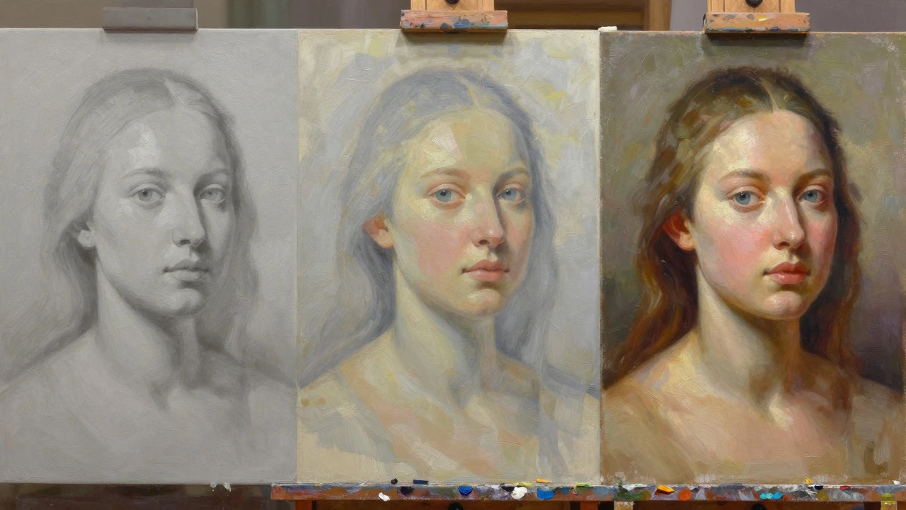
So, what do professional portrait artists actually do? Most avoid the binary choice of “first” or “last” entirely. Instead, they use a layered approach known as grisaille, which is a monochromatic underpainting technique used to establish values before adding color. This method separates the problem of value (light and dark) from the problem of color (hue and saturation).
- Block in the entire composition: Start with a thin wash of neutral gray or brown. Paint both the background and the figure together, focusing solely on shapes and values. Ignore color completely. Is the background darker than the forehead? Lighter than the chin? Get these relationships right now.
- Refine the values: Once the initial wash dries, refine the shadows and highlights across the whole canvas. Ensure the contrast between the subject and the background pushes the figure forward. A lighter background will make a darker subject pop, and vice versa.
- Add local colors: Now, apply transparent glazes of color over the dried grisaille. Because the values are already correct, you don’t have to worry about getting the darkness wrong. You just need to get the hue right.
- Finalize details: Finish the intricate details of the eyes, lips, and hair last, regardless of where they sit in the composition.
This technique eliminates the fear of ruining your work. Since everything starts as a flat, monochrome map, mistakes are easy to fix with a palette knife or solvent. It also ensures that the background and the face are visually connected from the very beginning.
Material Matters: Oil vs. Acrylic vs. Gouache
Your choice of medium dictates your workflow. Oil paint is a slow-drying medium that allows for blending and reworking over long periods. With oils, you can paint the background, let it sit for a week, and still blend into it. You can also paint the face, let it dry, and then paint the background around it without worrying about lifting the underlying layers. Oils offer flexibility that other mediums lack.
Gouache, on the other hand, is an opaque watercolor that dries matte and can reactivate when wet. With gouache, painting the background last is risky. If you go back in to adjust a shadow on the face, you might lift the pigment from the background you painted earlier. Many gouache artists paint from light to dark, meaning they lay down the brightest parts of the background and face first, then build up the darkest shadows last, regardless of location.
| Medium | Recommended Order | Key Advantage | Major Risk |
|---|---|---|---|
| Acrylic | Background First | Fast drying prevents accidental smudging later | Hard to blend edges if not planned perfectly |
| Oil | Grisaille / Layered | Flexible; can rework any area at any time | Long drying times can delay progress |
| Gouache | Light to Dark | Preserves opacity and vibrancy | Reactivating paint can muddy previous layers |
| Digital | Non-Destructive Layers | Unlimited undo; separate layers for BG and FG | Over-reliance on tools can weaken observational skills |
Understanding Focal Points and Visual Hierarchy
Regardless of the order, the goal is always to guide the viewer’s eye. In portrait art, the focal point is typically the area of highest contrast and detail, usually the eyes. If you paint the background with high contrast and intricate detail, it competes with the face. The portrait fails because the viewer doesn’t know where to look.
To solve this, simplify the background. Keep the brushstrokes loose and the values subtle compared to the face. Even if you paint the background first, resist the urge to finish it. Leave it slightly unfinished or blurred. This technique, called sfumato when applied to edges, softens the transition between the subject and the environment, pushing the background visually backward.
Consider the lighting. If the light source comes from the left, the background on the left should be brighter, and the right side darker. Establishing this gradient early on helps unify the piece. If you wait until the end to paint the background, you might forget to match the directional lighting of the face, resulting in a floating, disconnected head.
Common Mistakes to Avoid
- Muddy Colors: Mixing too many colors to try to match the background after the face is done. Stick to a limited palette for the background to keep it clean.
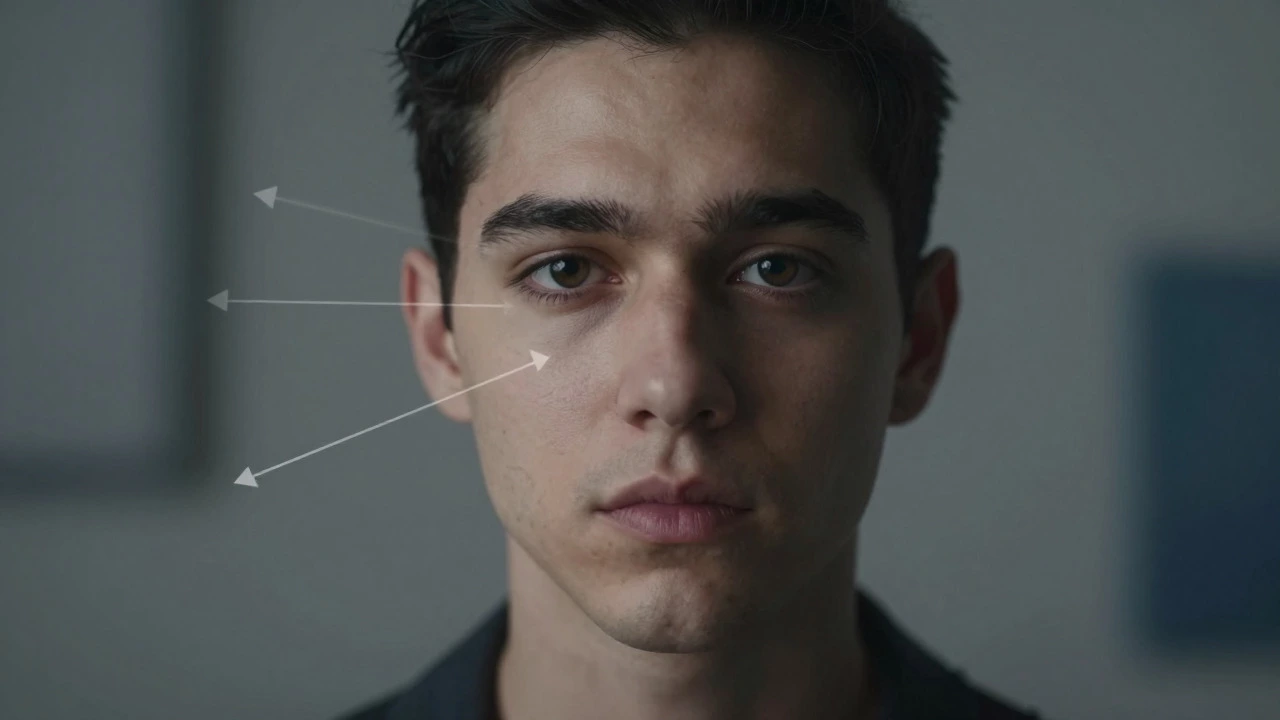
- Flat Values: Making the background the same average value as the face. This flattens the image. Ensure there is a distinct difference in brightness between the subject and the setting.
- Over-detailing: Adding texture to the background that rivals the skin texture. The background should support, not compete.
- Igoring Edges: Painting hard edges all around the subject. Soften the edges where the subject meets the background to create depth.
Practical Steps for Your Next Portrait
If you are unsure where to start, follow this safe, hybrid protocol that works for most mediums:
- Sketch lightly: Draw the outline of the face and the major shapes of the background. Don’t press hard.
- Tone the canvas: Apply a thin, neutral tint over the entire surface. This removes the intimidating white glare.
- Block in big shapes: Using large brushes, lay in the approximate colors of the background and the face simultaneously. Focus on getting the overall temperature (warm vs. cool) right.
- Develop the face: Spend 70% of your time refining the facial features, ensuring accurate proportions and expressive eyes.
- Adjust the background: Go back to the background. Does it push the face forward? If not, darken the areas near the head or lighten them, depending on the lighting. Add final touches to frame the subject.
This approach gives you the safety of establishing context early but allows you to prioritize the quality of the face. It balances efficiency with artistic integrity.
Should I paint the hair before the background in a portrait?
It depends on the style. If the hair blends into the background (lost-and-found edges), paint them together to ensure seamless transitions. If the hair is distinct and detailed, finish the hair before the background to avoid smudging delicate strands. Generally, treat the hair as part of the foreground subject, so it takes priority over the distant background.
Can I change the background after finishing the face in oil painting?
Yes, oil paint remains workable for a long time. You can scrape off a section of the background with a palette knife or paint over it with new layers. However, be careful not to drag paint onto the face. Using masking tape along the edges of the subject can protect your work while you experiment with the background.
What is the best background color for a beginner portrait?
A neutral mid-tone gray or warm brown is ideal. These colors are forgiving and allow you to easily judge light and dark values. Avoid stark white or pure black backgrounds initially, as they create extreme contrast that can distort your perception of the subject's tones.
How do I prevent the background from distracting from the face?
Reduce the contrast and detail in the background. Use larger, looser brushstrokes and limit the range of values. The face should have the sharpest edges and the highest contrast points (like the eyes). The background should feel softer and less defined to push it visually into the distance.
Is it better to use a photograph or a live model for practicing background integration?
Photographs are excellent for studying how light interacts with both the subject and the environment simultaneously. Live models are better for capturing expression and subtle color shifts in the skin. For learning background integration, start with high-quality photographs where the lighting is consistent, as this simplifies the value relationships you need to replicate.