Portrait Impact Analyzer
Painting Attributes
Impact Score
Have you ever stood in front of a painting and felt like the subject was looking right through you? It’s not magic. It’s craft. A great portrait painting does more than copy a face; it captures a presence. Whether it’s an oil on canvas from the 15th century or a digital piece made yesterday, the best portraits share specific traits that trigger an emotional response. You don’t need to be a master artist to recognize them, but understanding what makes them work can transform how you view art-and even how you create it.
The Power of the Eyes: The Window to Presence
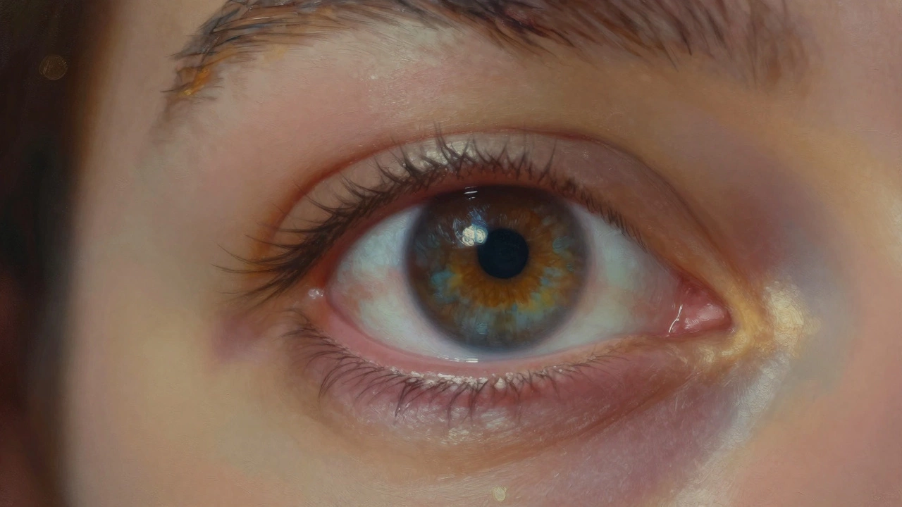
If there is one rule that holds true across centuries of art history, it is this: the eyes are everything. In a portrait, the eyes are the anchor. They establish the connection between the viewer and the subject. When artists talk about "life" in a painting, they are usually talking about the eyes.
Great portrait painters don’t just paint two circles with pupils. They focus on the catchlight-the tiny reflection of light in the eye. This small detail signals that the subject is seeing something, thinking about something, or reacting to their environment. Without catchlights, eyes look dead or glassy. With them, they feel alive.
Consider the difference between a snapshot and a painted portrait. A camera records every pore and wrinkle equally. A painter selects which details matter. Often, the artist will sharpen the focus on the eyes while softening the rest of the face. This technique guides your gaze immediately to where the emotion lives. If you are studying portraits, look closely at how masters like Rembrandt or John Singer Sargent handle the iris. They rarely use flat colors. Instead, they layer transparent glazes to create depth, making the eye look like a sphere rather than a flat disc.
Lighting as a Storyteller
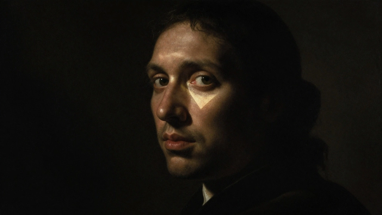
Light isn’t just illumination; it’s mood. The way light falls on a face dictates the tone of the entire piece. Harsh, direct light creates drama and exposes flaws, which can be powerful for showing age, hardship, or intensity. Soft, diffused light flatters and creates a sense of calm or intimacy.
In traditional studio portraiture, artists often use setups similar to photography. The Rembrandt lighting technique, named after the Dutch master who popularized it, places a key light at a 45-degree angle to the subject’s face, creating a small triangle of light on the cheek opposite the light source. This pattern adds volume and mystery. On the other hand, butterfly lighting, where the light comes from directly above and in front, casts a shadow under the nose shaped like a butterfly. It’s often used for glamorous or elegant portraits because it emphasizes symmetry.
But lighting also reveals character. Think about a portrait of a weary worker versus a portrait of a sleeping child. The lighting choices tell you who these people are before you read any biography. A great painter uses shadows not just to hide parts of the face, but to suggest what lies beneath the surface-thoughts, secrets, or memories.
Capturing Character Over Perfection
A common mistake beginners make is trying to make the subject look "perfect." They smooth out wrinkles, fix asymmetries, and brighten dull skin. But perfection is boring. It’s generic. What makes a portrait great is its honesty about the person’s unique identity.
Character comes from the imperfections. The slight tilt of the head, the tension in the jaw, the laugh lines around the mouth-these are the maps of a person’s life. A great portrait painting embraces these quirks. It doesn’t idealize; it interprets.
For example, when Thomas Gainsborough painted his aristocratic sitters, he didn’t just render their expensive clothes. He captured their posture, their haughtiness, or their boredom. You can feel their personality radiating off the canvas. In modern terms, we might say the painting has "attitude." But it’s deeper than attitude. It’s psychological insight. The artist observes how the subject holds themselves when they think no one is watching-or perhaps exactly when they know someone is looking.
Composition and Framing Choices
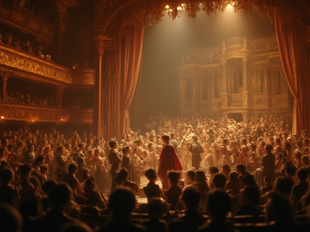
How much of the body do you show? This decision changes the message entirely. A tight close-up forces intimacy. It feels invasive, personal, and immediate. A full-length portrait includes context-clothing, setting, props-that tells us about social status, profession, or era.
Composition also involves negative space. Leaving empty areas around the head can isolate the subject, emphasizing their solitude or importance. Placing the subject off-center using the rule of thirds creates dynamic tension, making the image feel less static and more engaging.
Backgrounds matter too. A blurred background (often called bokeh in photography, achieved through loose brushwork in painting) keeps the focus on the face. A detailed background provides narrative. Does the subject stand in a library? A battlefield? A kitchen? The environment supports the story of the person. A great portrait balances the figure and ground so neither overwhelms the other unless intended.
Color Harmony and Emotional Tone
Color sets the emotional temperature of a portrait. Warm tones-reds, oranges, yellows-can evoke passion, energy, or warmth. Cool tones-blues, greens, purples-suggest calm, sadness, or detachment. Great painters choose palettes that reflect the inner state of the subject.
It’s not just about picking pretty colors. It’s about harmony. Using a limited palette ensures that all elements of the painting work together. For instance, if you use a warm skin tone, you might balance it with cool shadows. This contrast makes the skin glow. If everything is the same temperature, the painting can look muddy or flat.
Consider the work of Francis Bacon. His portraits often use jarring, acidic colors that create a sense of unease or distortion. This isn’t accidental. The color choice reinforces the psychological turmoil of the subjects. Conversely, Vermeer used soft blues and yellows to create serene, quiet moments. The color tells you how to feel before you analyze the details.
Brushwork and Texture: The Artist’s Hand
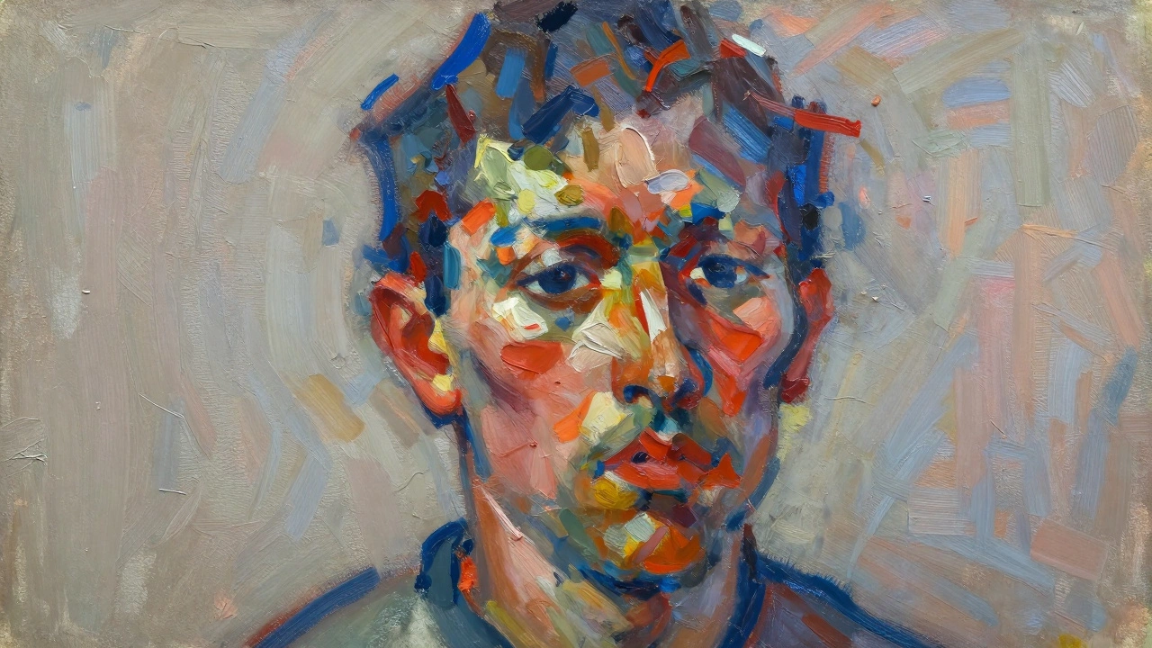
Finally, the physical application of paint matters. Some viewers prefer hyper-realism, where brushstrokes are invisible. Others love visible, energetic brushwork that shows the artist’s movement and speed. Both can be great, depending on the goal.
Visible brushstrokes add energy and texture. They remind the viewer that this is a human-made object, created by hands holding brushes. This tactile quality can make the portrait feel more immediate and raw. Artists like Willem de Kooning used thick, aggressive strokes to convey the vitality and complexity of their female subjects.
Smooth, blended surfaces, on the other hand, can create a sense of timelessness or ethereal beauty. The choice depends on the character of the sitter. A rough, textured style might suit a rugged outdoorsman, while a smooth finish might fit a delicate poet. There is no right or wrong, only appropriateness.
| Element | Function | Impact on Viewer |
|---|---|---|
| Eyes & Catchlights | Establishes connection and life | Creates immediate engagement |
| Lighting Direction | Defines mood and volume | Evokes specific emotions (drama, calm) |
| Character Details | Shows uniqueness and history | Builds empathy and recognition |
| Composition/Framing | Controls intimacy and context | Guides narrative interpretation |
| Color Palette | Sets emotional tone | Influences subconscious feeling |
| Brushwork Style | Reveals artist’s energy | Adds texture and authenticity |
Practical Tips for Aspiring Portrait Painters
If you want to improve your own portrait work, start by observing real people, not just photos. Photos flatten three-dimensional faces into two dimensions. Watching someone move, blink, and speak helps you understand the muscles beneath the skin.
- Study Anatomy: You don’t need to be a surgeon, but knowing where the zygomatic arch (cheekbone) sits helps you place shadows correctly.
- Practice Value Studies: Paint in grayscale first. If the values (lights and darks) are wrong, the colors won’t save it.
- Focus on the Triangle: Draw an imaginary line between the eyes and the bottom of the nose. Check proportions against this triangle.
- Use References Wisely: Combine multiple photos if needed, but ensure the lighting direction is consistent.
- Step Back: View your work from a distance. Squint your eyes to see the big shapes and values, not the tiny details.
Remember, a great portrait is a conversation. It invites the viewer to wonder about the person behind the paint. It’s not just about technical skill; it’s about empathy. When you care about capturing the essence of a human being, the techniques become tools to serve that purpose.
What is the most important part of a face to paint accurately?
The eyes are generally considered the most critical element. Specifically, the placement of the eyes relative to each other and the inclusion of catchlights (reflections) are vital for creating a lifelike appearance. If the eyes are off, the whole portrait feels wrong, even if the rest is technically perfect.
Can a portrait be great if it doesn't look realistic?
Absolutely. Realism is just one style. Portraits by artists like Picasso or Munch are highly distorted but are considered great because they capture emotional truth or psychological states effectively. The goal is expression, not necessarily photographic accuracy.
How does lighting affect the mood of a portrait?
Lighting defines the atmosphere. High-contrast lighting (chiaroscuro) creates drama, mystery, or intensity. Soft, even lighting suggests calmness, innocence, or neutrality. The direction of the light also models the form, adding depth and dimension to the face.
Why do some portraits feel "dead"?
Portraits often feel dead due to lack of contrast in the eyes (missing catchlights), flat lighting that removes dimension, or overly symmetrical features that lack natural human asymmetry. Another cause is focusing too much on copying details rather than capturing the overall gesture and expression.
What role does the background play in a portrait?
The background provides context and controls focus. A simple, neutral background isolates the subject, forcing attention onto the face. A complex background can tell a story about the subject's life, profession, or environment. It should complement, not compete with, the main subject.
Is it better to paint from life or from photographs?
Painting from life allows you to perceive true color relationships, subtle shifts in value, and the three-dimensional structure of the face. Photographs can distort perspective and flatten values. However, photos are useful for reference details. Many professional artists combine both methods for the best results.