Picturesque Landscape Analyzer
Select the visual characteristics present in your landscape image or mental scene to determine if it aligns with the Picturesque aesthetic (vs. Beautiful or Sublime).
Select attributes on the left to see how they align with the Picturesque theory.
Key Takeaway from the Article:
The Picturesque sits between the Beautiful (calm/smooth) and the Sublime (terrifying/vast). It values roughness, variety, and irregularity. As noted by Uvedale Price, true beauty often comes from complexity and decay rather than perfection.
You know that feeling when you look at a photo of a misty mountain range or a winding forest path and think, "Wow, that looks like a painting"? That reaction is exactly what picturesque landscape painting was designed to trigger. It’s not just about pretty scenery; it’s a specific visual language developed in the 18th century to make nature feel composed, interesting, and emotionally engaging without being terrifying.
Before we get into the weeds, here is the quick breakdown of what you need to know:
- The Core Idea: The picturesque sits between the Beautiful (calm, smooth) and the Sublime (terrifying, vast). It focuses on roughness, variety, and irregularity.
- Key Figures: William Gilpin coined the term; Uvedale Price and Richard Payne Knight refined the theory; Lancelot "Capability" Brown applied it to gardens.
- Visual Markers: Look for broken lines, textured surfaces, ruins, and asymmetrical balance.
- Modern Relevance: Instagram filters and travel photography still rely heavily on picturesque composition rules.
The Three Tiers of Nature: Beautiful, Sublime, and Picturesque
To understand the picturesque aesthetic, you have to understand what it wasn’t. In the mid-1700s, British thinkers were obsessed with categorizing how nature made us feel. Edmund Burke, in his famous philosophical inquiry, split nature into two camps: the Beautiful and the Sublime.
The Beautiful was easy to spot. Think of a calm lake, a smooth green meadow, or a gentle rolling hill. It’s pleasing, safe, and orderly. Then there was the Sublime. This was nature turned up to eleven-jagged cliffs, violent storms, endless oceans. The Sublime didn’t just please you; it overwhelmed you with a sense of awe and even fear.
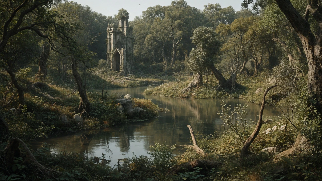
But people started noticing gaps. What about a gnarled old oak tree? What about a crumbling castle ruin half-hidden by ivy? These things weren’t "smooth" enough to be Beautiful, but they weren’t "terrifying" enough to be Sublime. They were interesting. They had character. Enter the third category: the Picturesque.
The Picturesque is all about roughness. It values textures that catch the light, shapes that break the eye’s rhythm, and scenes that feel like a carefully staged theater set. If the Sublime makes you feel small, the Picturesque makes you feel like an observer of a fascinating story.
William Gilpin and the Birth of the Tourist Gaze
You can blame one man for making this whole thing mainstream: William Gilpin. An Anglican clergyman and drawing master, Gilpin published Observations on the River Wye in 1782. He didn’t just write about art; he wrote a travel guide for tourists who wanted to see landscapes through an artist’s eyes.
Gilpin traveled around Britain with a camera obscura-a device that projected the landscape onto a piece of paper so he could sketch it. He wasn’t looking for accuracy; he was looking for effect. He taught readers to frame their views using natural elements like trees or arches. He called these "framing devices." If a view was too open, he’d suggest planting a tree to block out the boring bits. If a scene lacked depth, he’d add a foreground element like a rock or a cow.
| Feature | The Beautiful | The Sublime | The Picturesque |
|---|---|---|---|
| Primary Emotion | Calm, Pleasure | Awe, Terror | Interest, Curiosity |
| Visual Quality | Smooth, Polished | Vast, Dark, Formless | Rough, Broken, Varied |
| Lines & Shapes | Curved, Gentle | Indeterminate, Massive | Jagged, Irregular, Asymmetrical |
| Lighting | Clear, Even | Obscure, Dramatic | Partial, Dappled, Contrasting |
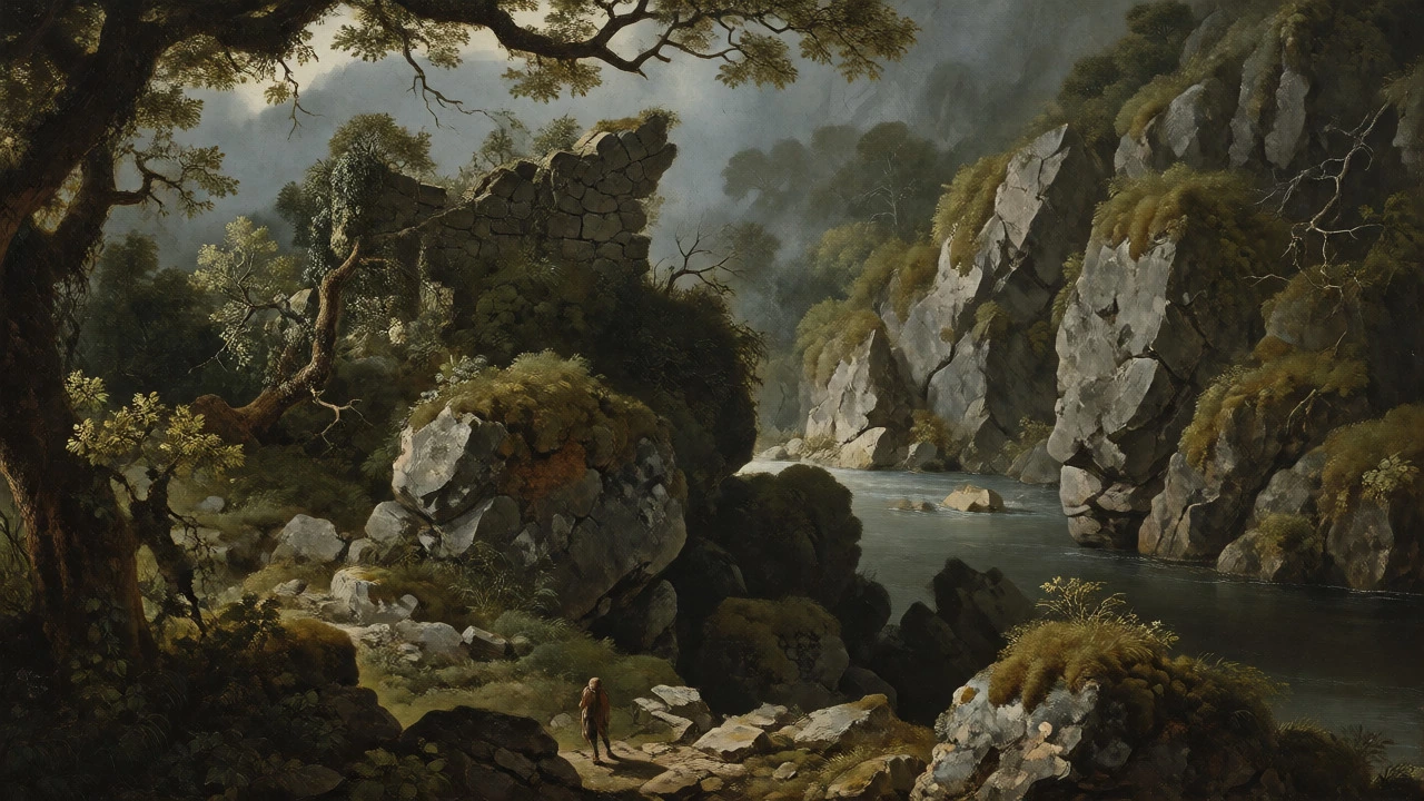
| Example Scene | Lawn with sheep | Alpine storm | Forest path with ruins |
Uvedale Price and the Theory of "Roughness"
If Gilpin popularized the idea, Uvedale Price gave it intellectual teeth. In his 1794 essay, Price argued that the Picturesque wasn’t just a subset of the Beautiful. It was a distinct principle based on intricacy and variety.
Price hated the smooth, manicured lawns that were popular in English gardens at the time. He thought they looked fake. To him, true beauty in nature came from decay and complexity. A moss-covered stone wall was more beautiful than a freshly painted fence because your eye had more places to rest. The brain enjoys solving visual puzzles, and rough textures provide those puzzles.
This shift changed how artists painted. Instead of trying to make everything look perfect and idealized, painters began to celebrate the messy parts of nature. Moss, lichen, twisted branches, and uneven ground became heroes of the canvas. The goal wasn’t to improve nature, but to reveal its inherent dramatic potential.
How to Spot a Picturesque Landscape Painting
So, how do you tell if a painting is actually picturesque? You don’t need a PhD in art history. Just look for these five visual cues. Once you start seeing them, you’ll notice them everywhere, from museum galleries to stock photos.
- Broken Lines: Avoid straight horizons or perfectly symmetrical trees. Picturesque compositions use zig-zags, curves that stop abruptly, and overlapping forms. The eye should never slide off the edge of the canvas; it should get caught in the details.
- Textural Contrast: Look for juxtaposition. Smooth water against jagged rocks. Soft clouds against hard stone ruins. This contrast creates visual tension that keeps you engaged.
- Asymmetry: Balance doesn’t mean mirror-image symmetry. It means weighing different elements against each other. A large tree on the left might be balanced by a small cottage and a group of figures on the right.
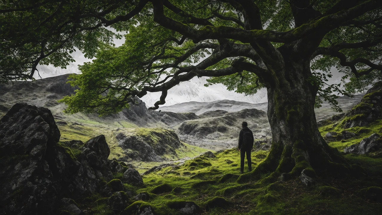
- Framing Devices: Notice if the scene is viewed through something else. A window, an archway, or a gap in the trees. This creates a sense of depth and makes the viewer feel like they are peeking into a private world.
- Human Scale Elements: Often, there’s a tiny human figure, a dog, or a boat. This isn’t just for scale; it adds a narrative hint. Who is walking down that path? Where did they come from? It turns a static landscape into a moment in time.
The Garden Revolution: From Lawns to Wilderness
The impact of the picturesque went way beyond oil paint. It completely redesigned the English countryside. Before the picturesque movement, wealthy landowners preferred geometric French-style gardens with straight paths and trimmed hedges. Then came Lancelot "Capability" Brown, followed by theorists like Humphry Repton, who argued that gardens should look like wild nature.
They dammed rivers to create serpentine lakes. They removed straight avenues of trees and replaced them with clumps of varied species. They added "follies"-fake ruins, Gothic towers, or Chinese bridges-to give the eye something interesting to focus on. These weren’t functional buildings; they were props for the landscape stage.
This was controversial. People mocked it. One critic joked that Brown would take a shovel, dig a hole, fill it with water, and call it a lake. But the public loved it. Suddenly, having a view of a "natural" wilderness outside your window was the ultimate status symbol. It showed you appreciated art, philosophy, and the finer points of taste.
Why the Picturesque Still Matters Today
You might think this is all dead history, locked away in dusty libraries. But look at your phone. When you post a photo of a hike or a vacation spot, what do you do? You crop it. You adjust the contrast. Maybe you add a filter that boosts the greens and deepens the shadows. You are applying picturesque principles instinctively.
Social media has arguably created a new era of hyper-picturesque culture. We seek out locations that promise that specific mix of beauty and drama. We want the "Instagrammable" shot-which usually means a framing device (like standing under a tree), a textured background, and a clear focal point. We reject the mundane and curate the interesting.
Even in modern digital art and concept design for video games, the picturesque rules apply. Designers create environments that feel explorable and full of hidden stories. They use lighting to highlight texture and lead the player’s eye. The logic hasn’t changed since Gilpin picked up his sketchbook in 1782; only the medium has.
Pitfalls to Avoid When Studying the Picturesque
If you’re diving deeper into this topic, watch out for a few common misconceptions. First, don’t confuse "picturesque" with "pretty." Pretty is subjective and often simple. Picturesque is technical and complex. A muddy ditch with a fallen log can be picturesque; a neat row of tulips is usually just pretty.
Second, avoid thinking of it as purely realistic. While it celebrated nature, it was highly artificial. Many "wild" forests in England were planted specifically to look wild. The ruins were often built to look older than they were. It’s a constructed reality, designed to evoke a specific emotional response.
Finally, remember the colonial context. Much of the picturesque tourism involved European elites traveling to places like Scotland, Wales, or Italy, viewing local cultures and landscapes through a lens of exoticism. The "primitive" locals were often part of the scenery, much like the cows or the ruins. Understanding this power dynamic adds necessary nuance to any appreciation of the genre.
What is the difference between sublime and picturesque?
The sublime evokes awe and terror through vastness and power (e.g., a massive waterfall), while the picturesque evokes interest and pleasure through roughness, variety, and detail (e.g., a rocky stream with mossy stones). The sublime overwhelms; the picturesque engages.
Who invented the concept of the picturesque?
While the idea existed earlier, William Gilpin is credited with popularizing the term in the late 18th century through his travel guides. Later theorists like Uvedale Price provided the philosophical framework.
Are ruins always part of picturesque landscapes?
Not always, but they are a very common trope. Ruins represent the passage of time and decay, which fits the picturesque love for roughness and melancholy. However, natural features like gnarled trees or jagged rocks serve the same purpose.
How does the picturesque affect modern photography?
It influences composition rules like leading lines, framing, and the rule of thirds. Photographers often seek high contrast and texture to create images that feel dynamic and interesting rather than flat or purely documentary.
Is the picturesque considered outdated?
No. While the specific 18th-century cultural context has faded, the visual principles remain dominant in landscape architecture, film cinematography, and social media aesthetics.