Landscape Color Mixer & Palette Guide
Select a landscape element to see the professional mixing recipe and visual approximation. Avoid using pure colors straight from the tube!
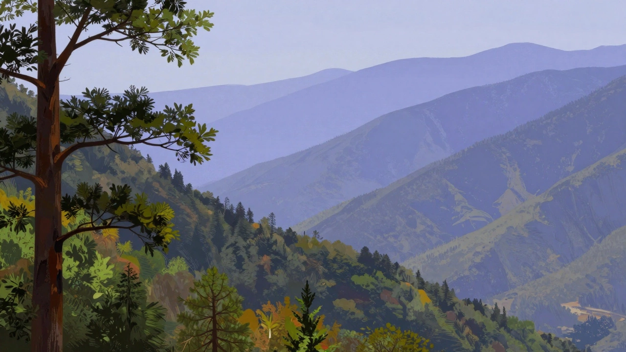
Organic Forest Green
Quick Tips for Your Palette
- Avoid using pure black; mix deep blues and browns for more natural shadows.
- Use complementary colors to mute bright tones and create realistic greens.
- Apply lighter, warmer colors to things closer to you and cooler, paler tones for distant hills.
- Limit your palette to 5-7 core colors to keep the painting cohesive.
Building Your Core Landscape Palette
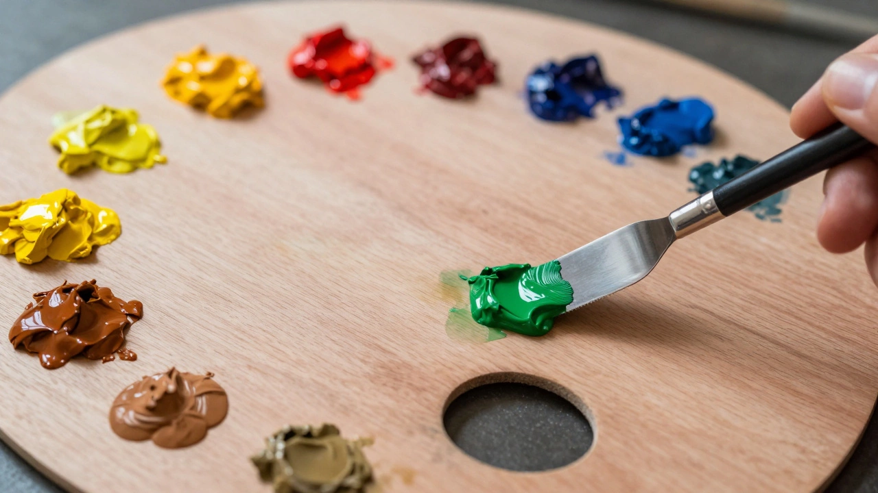
You don't need fifty different tubes of paint to capture a forest. In fact, having too many choices often leads to a muddy mess. Start with a limited set of high-quality pigments. For most landscape painting colours, you want a balance of warm and cool tones.
For your yellows, go for a Cadmium Yellow for bright sunlight and a Yellow Ochre for earthy, muted tones. For reds, a Alizarin Crimson provides a great deep red that works well for shadows and autumn leaves. When it comes to blues, Ultramarine Blue is your best friend for deep water and stormy skies, while Cerulean Blue captures that bright, clear midday atmosphere.
Don't forget your "earths." Burnt Sienna and Raw Umber are essential. These aren't just for dirt; they are the backbone of almost every shadow and tree trunk in nature. Mix them with blue to get a rich, dark forest green that doesn't look like plastic grass.
| Color Group | Recommended Pigment | Best Use Case | Tone Type |
|---|---|---|---|
| Yellows | Yellow Ochre | Dried grass, sand, soft sunlight | Warm/Muted |
| Blues | Ultramarine Blue | Deep water, distant mountains | Cool/Deep |
| Reds | Alizarin Crimson | Sunset glows, floral accents | Cool Red |
| Earths | Burnt Sienna | Autumn leaves, red clay, wood | Warm Earth |
| Whites | Titanium White | Clouds, foam, highlights | Neutral/Bright |
The Secret to Realistic Greens
If you use green paint straight from the tube, your painting will look like a child's drawing. Real foliage is a complex mix of yellow, blue, and brown. To get a natural look, try mixing your Phthalo Green or Viridian with a bit of Burnt Sienna. This "kills" the neon brightness and turns it into a deep, organic forest shade.
Think about the light source. Areas hit by the sun should have more yellow and white mixed in. Areas in the shade aren't just "darker green"-they often shift toward blue or purple. Try adding a touch of Ultramarine Blue to your greens in the shadowed parts of a bush. This adds depth and makes the foliage feel three-dimensional.
Ever notice how a distant forest looks blueish-grey? That is where Atmospheric Perspective comes in. As things get further away, the air between you and the object scatters light. This means colors lose their saturation and shift toward the cool end of the spectrum. Your closest trees should have the most contrast and warmest greens, while the furthest hills should be pale, muted blues.
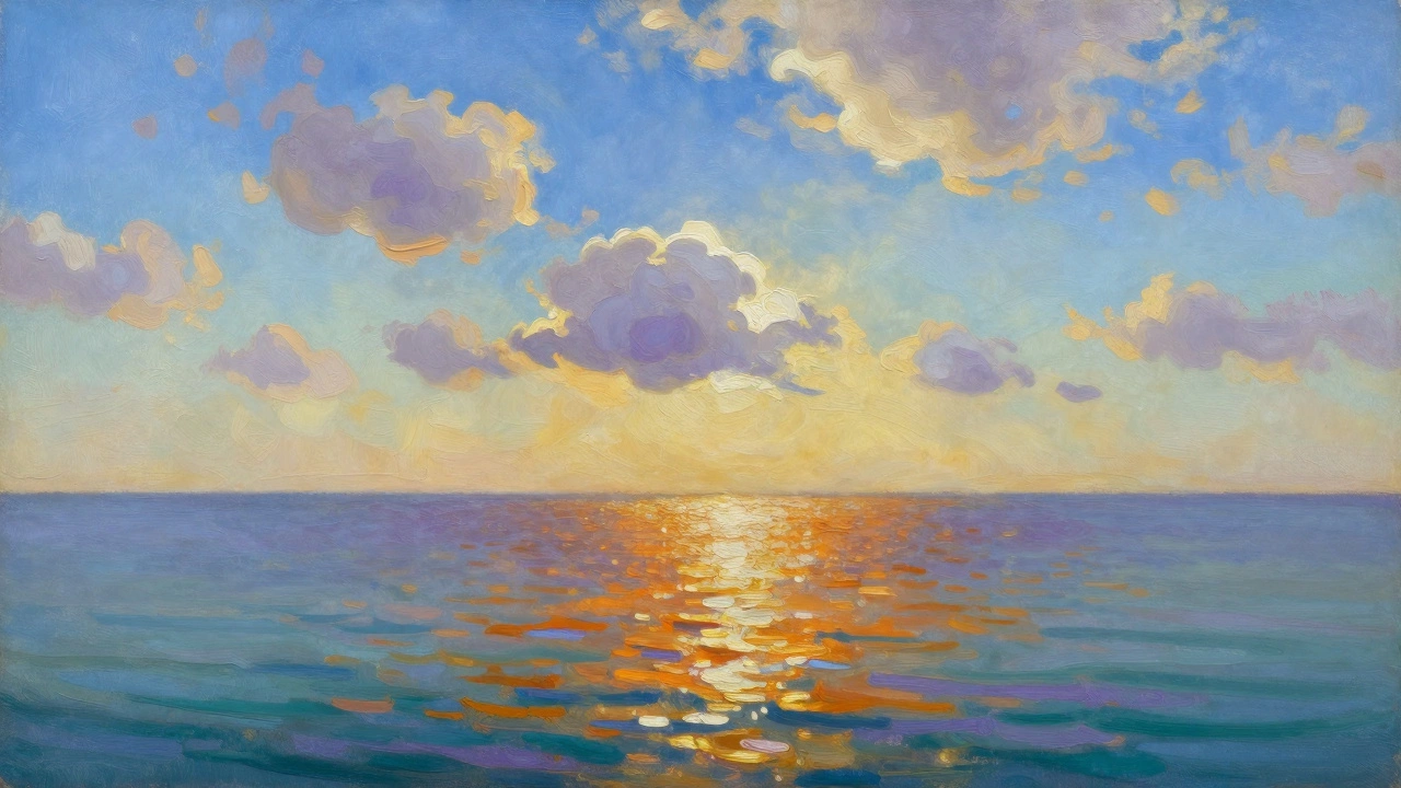
Capturing the Sky and Water
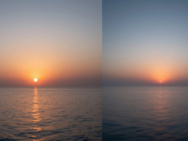
The sky is never just one shade of blue. If you look up, the zenith (the part directly above you) is usually a darker, deeper blue, while the horizon is much paler and often looks almost white or yellow. To achieve this, use a gradient. Start with a rich blue at the top and gradually mix in more white and a tiny bit of yellow or pink as you move toward the horizon line.
Water is basically a mirror, but it's a mirror that also has its own color. A lake in the mountains will reflect the blue of the sky, but the depth of the water adds a dark, teal quality. Use Color Theory here: if the sky is warm (sunset), the water will often carry those warm reflections, but the "local color" of the water remains cool. Don't be afraid to use dark purples or deep greens in the ripples of a river to give it weight.
For clouds, avoid using pure white for everything. The bottom of a cloud is in shadow, meaning it's often a pale grey or light violet. Use a mix of white and a tiny bit of Ultramarine or Raw Umber to create those soft, rounded bellies of the clouds, leaving the pure Titanium White only for the very top where the sun hits most intensely.
Working with Light and Shadows
The biggest mistake painters make is using black for shadows. In a real landscape, black is almost non-existent. Shadows are actually just "cooler" versions of the surrounding color. If you are painting a sun-drenched field of yellow grass, the shadows shouldn't be black or dark brown-try a deep violet or a mix of blue and burnt sienna.
This is based on the concept of Complementary Colors. Since yellow is the opposite of purple on the color wheel, adding a hint of purple to your yellow highlights creates a natural, muted contrast. This prevents the painting from looking too "sweet" or artificial.
Consider the time of day. A "Golden Hour" painting requires a palette heavy on warm yellows, oranges, and reds. The shadows during this time are often long and distinctly blue. On the other hand, a midday scene has harsh, short shadows with high contrast and bright, saturated colors. The key is consistency; if you decide the light is warm, every single shadow and highlight in the painting must reflect that same light source.
Common Pitfalls and How to Fix Them
One common issue is "chalkiness," which happens when you use too much white paint. White can wash out your colors and make them look like pastel chalk. Instead of adding white to lighten a color, try adding a lighter version of that color or a complementary light tone. For example, use a pale yellow instead of white to lighten a green meadow.
Another problem is the "lollipop effect," where a bright green tree sits on a brown background with no connection between them. To fix this, use Color Bleeding. Take a bit of the background brown and mix it into the edges of your tree. Take a bit of the tree's green and glaze it into the ground. This ties the elements together and makes the scene feel like one cohesive environment.
Finally, avoid over-mixing. If you stir your paint too much on the palette, you lose the "broken color" effect. Many great landscape artists leave small streaks of different colors side-by-side. When the viewer stands back, their eye mixes those colors naturally, which creates a shimmering, vibrating quality that looks much more like real nature than a perfectly smooth blend.
What is the best paint for landscape painting?
It depends on your style. Acrylics are great for beginners because they dry fast and allow you to layer colors quickly. Oils are preferred by professionals for landscapes because they dry slowly, making it much easier to blend soft skies and hazy mountains. Watercolors are perfect for a light, airy, and spontaneous feel, though they are harder to correct once a mistake is made.
How do I make a sky look realistic?
The key is the gradient. Use a darker blue at the top of the canvas and gradually transition to a lighter, warmer tone (like a pale yellow or soft white) at the horizon. Avoid using a single flat color across the whole sky. Also, add a few thin, wispy layers of white and grey for clouds to create a sense of depth.
Why do my greens look fake?
Your greens probably look too saturated. Nature is full of browns, greys, and yellows. To fix this, mix your green with a touch of red or orange (its complementary color) or add a bit of Burnt Sienna. This mutes the intensity and makes the foliage look organic and weathered.
Should I use black paint for shadows?
Generally, no. Pure black often looks like a "hole" in the canvas and can make your painting look flat. Instead, create "chromatic blacks" by mixing Ultramarine Blue and Burnt Umber. This creates a deep, rich dark tone that still has a temperature and feels integrated into the environment.
How do I paint distant mountains?
Use atmospheric perspective. Mountains in the distance should be lighter in value, less saturated, and shifted toward a cool blue or purple hue. The further away the mountain is, the more it should blend into the color of the sky at the horizon.
Next Steps for Improving Your Work
If you are feeling stuck, try a "color study." Instead of painting a full picture, spend thirty minutes just mixing the colors of a specific scene. Try to match the exact shade of a leaf or a rock. This trains your eye to see the subtle shifts in hue that you normally ignore.
Another great exercise is the limited palette challenge. Try to paint an entire landscape using only three colors plus white (for example, Red, Yellow, and Blue). This forces you to understand how to mix every other color you need and prevents your palette from becoming too chaotic.
Finally, take your painting outside. Painting "en plein air" is the best way to learn. The light changes every ten minutes, and you'll realize that a field that looked green at 10 AM looks golden at 4 PM. Learning to react to these changes in real-time is what separates a static painting from one that feels like it's breathing.