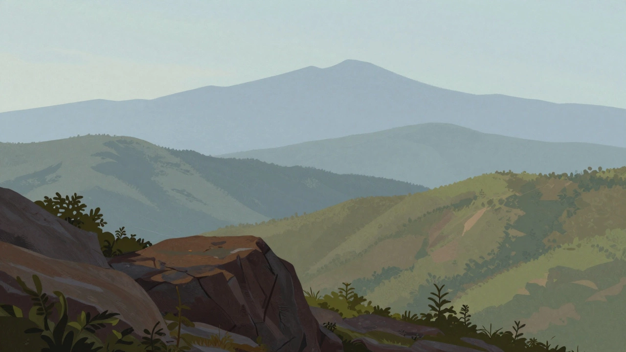
Atmospheric Perspective Simulator
Adjust the sliders to see how objects change as they move further away into the distance.
Key Principles:
- Foreground: Dark, Warm, Sharp
- Background: Light, Cool, Soft
- Midground: Balanced Transition
Simulated Object View
Look at a gallery wall filled with sweeping mountain ranges or serene forest paths. It’s easy to assume that landscape painting is reserved for the gifted few-artists who were born with an innate ability to capture light and distance. But here is the truth: landscape painting isn’t hard because it requires magic. It’s hard because it demands you manage a lot of variables at once. Light changes, weather shifts, and perspective can trick your eye if you aren’t careful.
If you are wondering whether you should pick up a brush and try it yourself, the answer is yes. But you need to know what you are getting into. This guide breaks down why landscape art feels difficult, where most beginners get stuck, and how you can start creating convincing scenes without feeling overwhelmed.
The Core Challenge: Why Landscape Painting Feels Difficult
When you sit down to paint a still life, like an apple on a table, the object doesn’t move. The light stays relatively constant. In landscape painting, which involves depicting natural scenery such as mountains, valleys, trees, rivers, and forests, nothing stays still. The sun moves across the sky every minute, altering shadows and colors. Clouds drift over peaks. Leaves rustle in the wind.
This constant change creates what artists call "decision fatigue." You have to decide on composition, color mixing, and value structure while the subject itself is evolving. For many beginners, this speed is the biggest barrier. You might spend ten minutes mixing the perfect shade of green for a distant tree, only to realize the light has shifted and that green no longer matches the scene.
Another major hurdle is scale. A real landscape is vast. You are trying to fit miles of terrain onto a small canvas or paper. This requires you to simplify complex details into shapes and colors. If you try to paint every leaf and blade of grass, your work will look cluttered and chaotic. Learning to edit reality-to choose what to include and what to leave out-is a skill that takes time to develop.
Common Pitfalls That Trip Up Beginners
Most people who struggle with landscape painting fall into one of three traps. Recognizing these early can save you months of frustration.
- Muddy Colors: This happens when you mix too many colors together on your palette or keep reusing brushes that hold old paint. Fresh greens turn brown, and skies lose their clarity. Clean brushes often mean cleaner paintings.
- Flat Perspective: Without proper depth cues, a landscape looks like a flat backdrop. Beginners often forget that distant objects become lighter, cooler (bluer), and less detailed than nearby objects. This phenomenon is called atmospheric perspective.
- Overworking Details: Trying to replicate every texture leads to stiff, unnatural-looking paint. Nature is organic; rigid lines and repetitive patterns make a painting look artificial. You need to suggest detail rather than define it precisely.
Avoiding these mistakes isn’t about talent-it’s about technique. Once you understand the rules of color and space, you can break them intentionally rather than accidentally.
Mastering Atmospheric Perspective
If there is one secret weapon in landscape art, it is atmospheric perspective. This concept explains why mountains in the distance look blue and hazy, while rocks in the foreground are sharp and colorful. Air contains particles like dust and moisture that scatter light. As you look further away, more air sits between your eye and the object, causing colors to shift toward the background hue-usually blue or gray.
To use this in your work, follow a simple rule: as objects move back in space, make them lighter, cooler, and softer. Your foreground elements should be dark, warm, and sharp. Your middle ground sits somewhere in between. Your background should be light, cool, and blurry.
Try this exercise next time you paint outside. Look at a road disappearing into the hills. Notice how the asphalt gets lighter and bluer as it recedes. Copy that gradient on your canvas. Instantly, your flat surface will gain depth. This single technique solves half the problems new painters face with spatial realism.
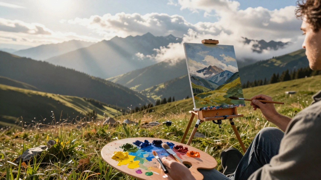
Working Outdoors vs. Indoors
You don’t have to paint outside to create landscapes. In fact, many professional landscape artists work primarily from photographs or sketches made outdoors. However, plein air painting, which means painting directly from nature, offers unique benefits.
| Factor | Indoor Studio Work | Outdoor Plein Air |
|---|---|---|
| Light Control | Constant and predictable | Changing rapidly; requires quick adaptation |
| Color Accuracy | Dependent on photo quality | Direct observation of true color relationships |
| Comfort | High; controlled environment | Low; exposed to weather, insects, and uneven ground |
| Learning Curve | Easier for beginners to focus on technique | Steeper due to environmental distractions |
If you are just starting, I recommend beginning indoors. Use high-quality reference photos to practice composition and color mixing without the pressure of fading sunlight. Once you feel comfortable with basic shapes and values, take your easel outside. Start with short sessions-just thirty minutes-to capture the initial impression of a scene before the light changes too much.
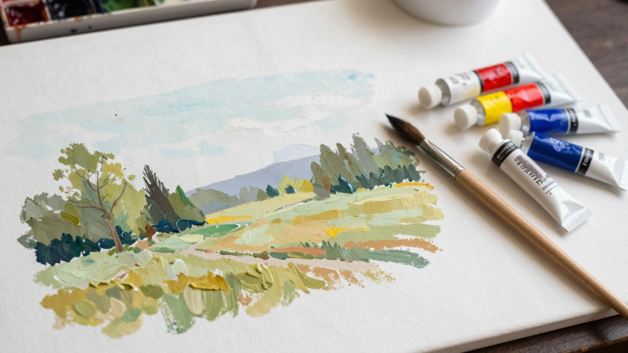
Essential Tools for Starting Out
You don’t need expensive gear to start. In fact, limiting your tools can help you learn faster. Here is a minimal kit that covers all your needs:
- Palette Knife: For mixing paints cleanly and applying thick layers.
- Bristle Brushes: Stiff bristles are great for breaking up canvas texture and creating rough textures like bark or stone.
- Sable or Synthetic Filbert Brushes: These oval-shaped brushes are versatile for blending skies and softening edges.
- Limited Palette: Start with Titanium White, Cadmium Yellow, Cadmium Red, Ultramarine Blue, and Burnt Umber. You can mix almost any color from these five.
- Canvas Panels: Cheaper than stretched canvases and easier to carry outdoors.
Having fewer colors forces you to learn how to mix properly. If you have twenty tubes of paint, you might reach for a "green" tube instead of learning to mix yellow and blue. Mixing your own colors gives you control over saturation and temperature, which is crucial for realistic landscapes.
Step-by-Step Approach to Your First Landscape
Don’t try to paint a masterpiece on day one. Follow this structured process to build confidence:
- Thumbnail Sketches: Before touching paint, draw three small black-and-white sketches on paper. Focus on big shapes: where does the horizon line go? Where are the dark masses? Keep it simple.
- Block In Values: On your canvas, use thin washes of paint to lay in the darkest darks and lightest lights. Ignore color for now. Get the value structure right.
- Add Local Colors: Once the values are correct, add your base colors. Remember to keep distant areas lighter and cooler.
- Refine Edges: Sharpen edges in the foreground where details matter. Soften edges in the background to push them back.
- Final Adjustments: Step back and look at the whole painting. Add highlights to catch the eye and darken shadows if needed.
This method prevents you from getting lost in details too early. Many beginners fail because they start by painting a specific tree branch before establishing the overall composition. By working from general to specific, you ensure the painting holds together.
Building Confidence Through Practice
Landscape painting improves with repetition. Don’t judge your first attempts harshly. Even masters like J.M.W. Turner or John Singer Sargent produced hundreds of studies before creating finished works. Treat each painting as an experiment.
Focus on one element at a time. One week, concentrate only on painting convincing skies. The next week, focus on water reflections. Break the large challenge into smaller, manageable skills. Over time, these skills combine into a cohesive style.
Remember, the goal isn’t to photographically copy nature. It’s to interpret it through your eyes. Your personal perspective is what makes your art valuable. Embrace the difficulties-they are part of the creative journey.
Do I need to be good at drawing to paint landscapes?
Basic drawing skills help, but they are not strictly necessary. Painting allows you to adjust shapes and compositions more easily than drawing. Focus on blocking in large shapes with paint rather than precise line work. As your painting skills improve, your underlying drawing abilities will naturally strengthen.
What is the best type of paint for beginners?
Acrylics are often recommended for beginners because they dry quickly, are easy to clean with water, and are forgiving. You can paint over mistakes easily. Oil paints offer richer blending and slower drying times, which some prefer for landscapes, but they require solvents and take longer to master. Watercolors are portable but less forgiving since you cannot paint light over dark.
How do I mix realistic greens for foliage?
Avoid using straight green from the tube, as it often looks artificial. Mix yellow and blue to create green, then adjust the tone with white to lighten or burnt umber to darken. Add a touch of red or orange to neutralize the green and make it look more natural. Observe how light affects the leaves; sunlit sides are warmer, while shadowed sides are cooler.
Can I paint landscapes from photos?
Yes, many artists use photos as references. However, be aware that cameras compress dynamic range and flatten perspective. Use photos for composition ideas and color references, but try to exaggerate contrasts and deepen atmospheric perspective to avoid a flat look. Combining multiple photos can also help create a more dramatic scene.
Why do my landscape paintings look muddy?
Mudiness usually results from over-mixing colors or dirty brushes. Keep your palette organized and wipe your brushes frequently. Limit the number of colors you mix for any single area. Also, ensure you have strong contrast between light and dark values; low contrast often appears muddy even if the colors are clean.