Ever painted a landscape that looked flat, boring, or just... ordinary? You’re not alone. Many artists spend hours on a scene-rolling hills, a quiet lake, a line of trees-and end up with something that feels lifeless. The problem isn’t skill. It’s visual interest. A landscape doesn’t need to be dramatic to be compelling. It just needs to pull the viewer in, make them pause, and make them wonder what’s happening just beyond the frame.
Start with a strong focal point
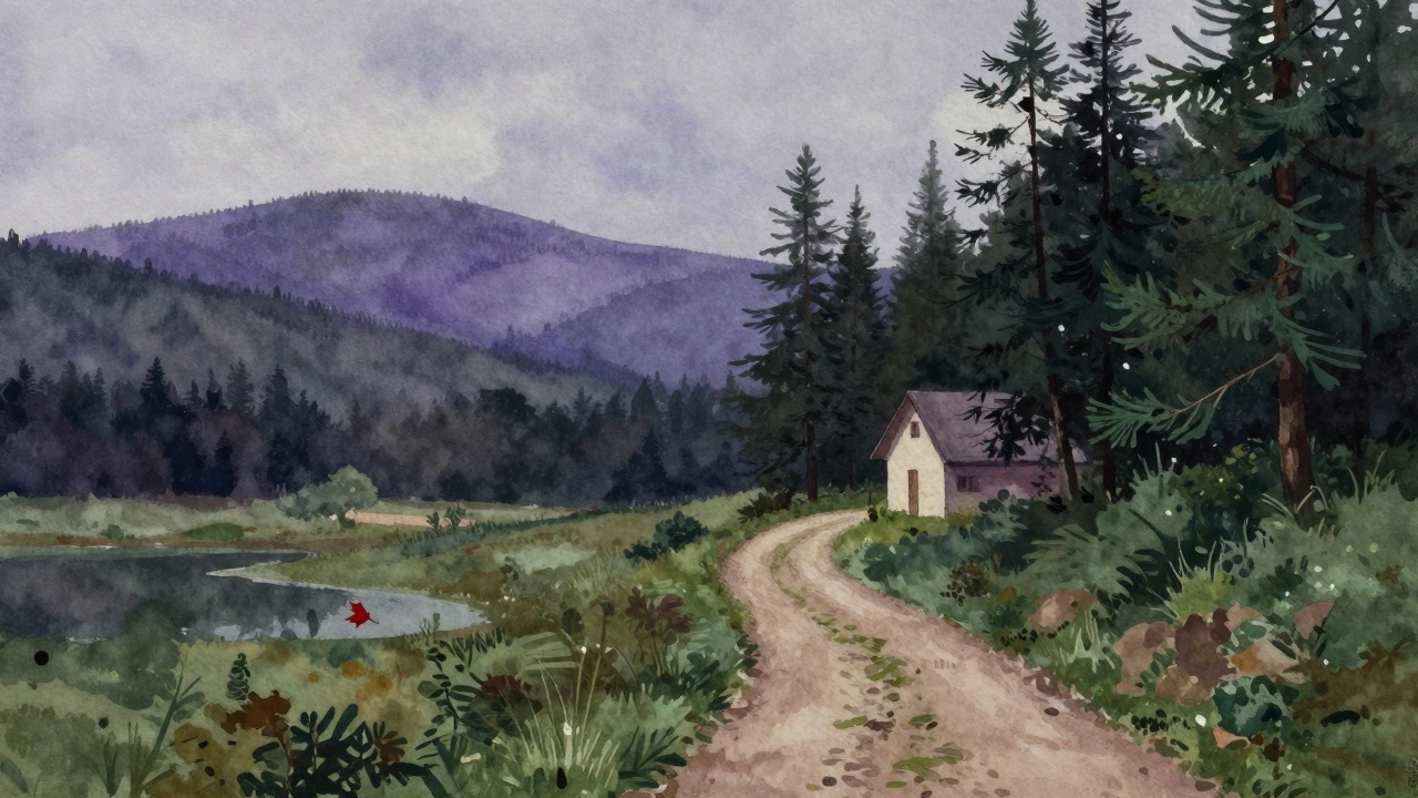
A landscape without a focal point is like a story without a climax. Your eye doesn’t know where to land. The most common mistake? Putting the main subject right in the center. It feels static. Instead, use the rule of thirds. Imagine your canvas divided into a 3x3 grid. Place your strongest element-like a lone tree, a cabin, or a winding path-at one of the intersections. That’s where the eye naturally goes. A cabin slightly off-center, half-hidden by pines, feels more mysterious than one smack in the middle. It invites the viewer to explore the rest of the painting to find out why that spot matters.Build depth with atmospheric perspective
One of the easiest ways to make a landscape feel real is to show distance. In nature, distant objects don’t look the same as close ones. They lose contrast, color saturation, and detail. That’s atmospheric perspective. Paint your foreground with rich, dark greens and sharp edges. As you move toward the horizon, shift to cooler, lighter tones-blues, grays, soft lavenders. Reduce the detail. A tree in the distance? Just a smudge of muted green. A mountain range? No texture, just a soft silhouette. This trick tricks the brain into seeing space. It’s why a simple watercolor of rolling hills can feel vast, even if it’s only 8x10 inches.Use color contrast, not just realism
Realism doesn’t equal interest. In fact, painting exactly what you see often leads to dull results. Try pushing your colors. A field of grass doesn’t have to be green. Add hints of olive, burnt sienna, or even a touch of violet in the shadows. The sky doesn’t have to be blue. Try pale peach near the horizon, fading into cool gray-blue at the top. Contrasting warm and cool tones creates energy. A warm red barn against a cool blue shadow makes the barn pop. A golden sunset reflected in a lake with purple undertones feels alive. You’re not lying-you’re revealing the hidden truth of light and mood.
Add movement with leading lines
Lines guide the eye. A winding river, a dirt road, a row of fence posts, even the curve of a shoreline-they all pull the viewer through the painting. Without them, the eye gets stuck. Look at your composition. Is there a path that starts in the foreground and leads toward the background? If not, create one. Even a subtle S-curve in a creek or the angle of a fallen log can do the job. Leading lines don’t have to be obvious. Sometimes, the suggestion of movement-like ripples in water fading into the distance-is enough to keep the viewer engaged.Introduce unexpected elements
A landscape doesn’t need to be perfect to be powerful. Add something slightly out of place. A single red leaf floating in a still pond. A broken fence post leaning into the wind. A bird in flight, barely visible. These small surprises create narrative. They make the viewer ask: What happened here? Why is that there? That’s what turns a pretty scene into a story. You don’t need to paint a storm or a fire. Just one quiet, odd detail can change everything. In Vancouver, I’ve seen old boots half-buried in moss near a trail. That’s the kind of thing that makes a painting feel lived-in, not staged.Play with light and shadow
Light is the soul of a landscape. The time of day changes everything. A midday sun flattens everything. But golden hour? That’s magic. Long shadows stretch across fields. Highlights glow on the edges of leaves. Even in overcast weather, you can find drama. Clouds diffusing light create soft, moody tones. Don’t paint shadows as just dark gray. Use purple, blue, or even a hint of green. Shadows aren’t empty-they hold color, texture, and mood. Paint the light hitting the edge of a rock, then let the shadow behind it feel alive, not flat. That contrast is what makes the scene breathe.
Limit your palette for harmony
Too many colors create chaos. Limiting your palette forces focus. Try a triad: one warm, one cool, and one neutral. For example: burnt sienna, ultramarine blue, and raw umber. That’s it. You can mix endless variations from just three. It creates unity. The whole painting feels like it belongs together. Even if you add a touch of cadmium yellow for a sunbeam, the rest of the piece stays grounded. This technique is used by masters like Andrew Wyeth and Edward Hopper. They didn’t use 20 tubes of paint. They used a few, masterfully. Less becomes more.Don’t paint everything
This might sound counterintuitive, but the most interesting landscapes leave something to the imagination. You don’t need to paint every leaf, every rock, every blade of grass. Suggest. Let the viewer fill in the gaps. A few brushstrokes for a distant forest. A wash of watercolor for clouds. A single dark line for a tree trunk. The brain loves to complete things. If you overwork a section, it becomes stiff. If you leave space, it becomes alive. Think of it like music-silence is as important as the notes.Paint from memory, not just photos
Photos flatten depth, crush contrast, and freeze moments that feel unnatural. If you paint only from photos, you’re copying, not creating. Go outside. Sit with the landscape. Observe how the light shifts. Notice how the wind moves the grass. Feel the air. Then go back to your studio and paint from what you remember. You’ll naturally emphasize what moved you-the way the light caught a ridge, the sound of water, the smell of damp earth. That emotional truth translates into something a photo never could.| Technique | What to Do | What to Avoid |
|---|---|---|
| Focal Point | Place key element off-center, using rule of thirds | Centering the main subject |
| Atmospheric Perspective | Make distant objects lighter, cooler, less detailed | Painting distant hills with the same intensity as foreground |
| Color Contrast | Use warm vs. cool tones to create energy | Painting everything in naturalistic, flat colors |
| Leading Lines | Use curves, paths, or edges to guide the eye | Letting the eye wander without direction |
| Unexpected Details | Add one quiet, odd element (e.g., a single red leaf) | Painting only perfect, predictable scenes |
| Light & Shadow | Paint shadows with color (purple, blue), not just gray | Using flat, neutral shadows |
| Limited Palette | Use 3-5 core colors and mix everything from them | Using every color in your tube |
Can I make a landscape painting interesting without adding more details?
Absolutely. Often, less is more. Removing details-like painting distant trees as soft shapes instead of individual leaves-gives the viewer room to imagine. What you leave out can be more powerful than what you include. A few well-placed brushstrokes can suggest a whole forest. The magic is in suggestion, not precision.
Should I always paint from life, or are photos okay?
Photos are useful for reference, but they’re not enough. They flatten depth, kill mood, and freeze moments that feel unnatural. Paint from life when you can. If you can’t, use your memory of the scene. What did you feel? What caught your eye? That emotional truth will come through in your brushwork far more than a photo’s technical accuracy.
How do I know if my painting has enough depth?
Step back and squint. If everything looks flat or equally sharp, you’re missing atmospheric perspective. Try painting the foreground with strong, dark, detailed strokes. Then make the middle ground softer. The background should be barely there-just hints of color and shape. If you can’t tell what’s near and what’s far, add more contrast in tone and detail.
What’s the quickest way to fix a boring landscape?
Add one unexpected detail. A single red bird, a broken branch, a patch of wildflowers in an otherwise quiet field. It doesn’t have to be big. Just one small, surprising element gives the viewer a reason to pause and wonder. That’s often all it takes.
Do I need expensive paints to make a landscape interesting?
No. What matters is how you use color, not how much you have. Many great landscapes were painted with just three or four pigments. Focus on mixing tones, controlling value, and using contrast. A tube of cadmium red won’t save a flat composition. A thoughtful application of color will.
If you want your landscapes to feel alive, stop trying to copy nature. Start interpreting it. Let your brush speak what your eyes felt-not just what they saw. The most memorable landscapes aren’t the most accurate. They’re the ones that carry emotion, mystery, and quiet surprise.