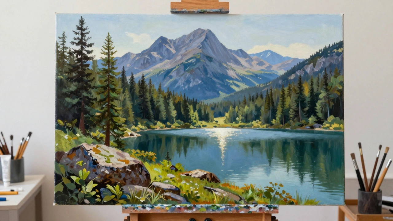
Landscape Depth & Perspective Planner
1. Foreground
Closest to viewerUse warm colors with high contrast. Details should be sharp and distinct.
2. Middle Ground
Transition areaColors become slightly cooler. Contrast decreases. Edges start to soften.
3. Background
Horizon / DistanceUse cool colors. Values are very light. Details disappear entirely.
Painting Strategy Summary
- Palette Mix: Start with your foreground greens/yellows. For the middle ground, add blue/grey. For the background, mix mostly white with a touch of ultramarine blue.
- Brushwork: Use stiff bristles/dabbing for the foreground texture. Switch to softer brushes or glazing for the middle ground. Keep the background smooth and reflective.
- Focus: Reserve your sharpest edges and finest details for the Foreground. Let other areas remain impressionistic to guide the eye.
There is a specific moment when a flat canvas suddenly feels like you could step into it. The trees have weight. The sky has depth. The light hits the water with a convincing shimmer. This isn't magic; it's a series of deliberate choices about how light behaves and how our eyes perceive distance. If you have ever painted a scene that looked flat or cartoonish, you are not alone. Most beginners struggle because they paint objects (a tree, a rock) rather than relationships (light, shadow, atmosphere).
Making a realistic landscape painting requires shifting your focus from drawing shapes to capturing light and space. It demands patience, observation, and a willingness to simplify complex details into manageable masses. Whether you are working in oils, acrylics, or watercolors, the principles remain the same. You need to understand how color changes over distance, how to build form through value, and how to handle edges so they guide the viewer’s eye.
The Foundation: Composition and Value Studies
Before you pick up a brush to add detail, you must establish the structural integrity of the painting. A realistic image fails if the underlying structure is weak. Start with a thumbnail sketch. Do not worry about colors yet. Focus on the arrangement of light and dark areas. This is called a value study.
| Element | Purpose | Common Mistake |
|---|---|---|
| Focal Point | Guides the viewer's eye to the most important area | Too many competing focal points create visual chaos |
| Value Contrast | Creates depth and defines forms | Using similar values throughout makes the painting look muddy |
| Leading Lines | Draws the eye into the picture plane | Lines leading out of the canvas distract the viewer |
Use simple geometric shapes to block in your major elements. A mountain range might be a triangle. A forest cluster might be an irregular oval. Keep these shapes loose. If you define every leaf at this stage, you will lose the ability to adjust the overall composition later. The goal here is to ensure that the light source is consistent. Where is the sun? Which sides of the objects are lit, and which are in shadow?
Understanding Atmospheric Perspective
This is the single most important technique for creating depth. In real life, we do not see distant objects as clearly as close ones. The air between us and the horizon contains moisture, dust, and particles. These particles scatter light, causing distant objects to appear lighter, cooler, and less saturated.
To apply this in your painting, follow these rules:
- Foreground: Use warm colors (yellows, oranges, deep greens). Keep values high contrast (dark shadows, bright highlights). Details should be sharp and distinct.
- Middle Ground: Colors become slightly cooler and less intense. Contrast decreases. Edges start to soften.
- Background: Use cool colors (blues, purples, grays). Values are very light, often close to white but tinted with blue. Contrast is minimal. Details disappear entirely.
For example, if you are painting a pine forest, the trees closest to you might be a deep, rich green with black shadows. As the trees recede, mix more blue and gray into your green. By the time you reach the horizon, those trees should look like faint blue silhouettes against the sky. This shift in temperature and value tricks the brain into perceiving three-dimensional space on a two-dimensional surface.
Color Mixing for Natural Light
Many artists make the mistake of using straight tube colors. Pure cadmium yellow or ultramarine blue rarely exists in nature without modification. Realistic landscapes require nuanced mixes. Your palette should allow you to create a wide range of tints and shades.
A standard landscape palette includes Titanium White, Cadmium Yellow Light, Cadmium Red Light, Ultramarine Blue, Burnt Sienna, and Sap Green. However, avoid using Sap Green directly for foliage. Instead, mix your own greens using Yellow and Blue. Adding a touch of Red (the complementary color of Green) will neutralize the brightness and create a natural, earthy tone.
Light is never just white. Shadows are never just black. Highlights contain hints of the surrounding color. If the sun is setting, your highlights might have a pink or orange cast. If you are painting under an overcast sky, your whites will lean towards gray or blue. Always observe the local color (the actual color of the object) and then modify it based on the lighting conditions.
Edge Control: The Secret to Realism
Edges define how solid or ethereal an object appears. In photography, everything is in focus until you zoom in. In painting, you must decide what is in focus and what is not. This is done through edge control.
- Hard Edges: Used for the focal point and foreground elements where light meets shadow abruptly. Think of the branch of a tree against a clear sky.
- Lost and Found Edges: Used when an object blends into its background. A tree trunk might disappear into the darker shadows of the forest behind it. This creates unity and prevents the painting from looking like a collage of cutouts.
- Soft Edges: Used for middle ground and background elements. Clouds, distant hills, and foggy areas should have blurred transitions.
Practice glazing thin layers of paint to soften edges. Alternatively, use a dry brush to drag paint gently across the boundary. Avoid outlining objects with dark lines. Nature does not have outlines; it has boundaries created by contrast in value and color.
Building Texture and Detail
Detail is the final layer of realism, but it must be applied sparingly. Too much detail everywhere creates visual noise. Reserve your finest brushes and sharpest edges for the focal point. Let other areas remain impressionistic.
For foliage, use dabbing motions with a fan brush or a stiff bristle brush. Vary the direction of your strokes to mimic the chaotic growth of leaves. For rocks, use thicker paint (impasto) to create physical texture. For water, keep the surface smooth and reflective. Horizontal strokes work best for calm water, while short, choppy strokes suggest movement.
Remember that detail supports the whole. If a detailed flower distracts from the main subject, blur it or darken it. Every mark on the canvas should serve the composition. Step back frequently to check your progress. What looks good up close may be overwhelming from a distance.
Troubleshooting Common Issues
If your painting looks flat, check your values. Squint at your reference photo or view. Can you distinguish the lightest lights from the darkest darks? If everything looks mid-tone, increase your contrast. Add more white to the highlights and more dark pigment to the shadows.
If colors look muddy, you are likely mixing too many pigments together. Limit your mixes to two or three colors. Clean your palette knife regularly. Also, ensure you are not overworking the paint. Blending wet paint excessively destroys the clarity of the color. Allow layers to dry before adding new ones, especially in oil painting.
If edges look harsh, soften them. Use a clean, dry brush to blend the transition between colors. Or, paint a soft edge first, then add hard details only where necessary. Realism is not about rendering every pixel; it is about suggesting reality through selective precision.
What is the best medium for realistic landscape painting?
Oil paint is often preferred for realism due to its slow drying time, which allows for seamless blending and subtle gradations. Acrylics can also achieve realism but require faster work or retarders to keep the paint wet. Watercolor is challenging for high-detail realism but excels in capturing light and atmosphere.
How do I paint realistic clouds?
Clouds are defined by their shadows, not their white tops. Paint the sky first, then add the cloud shapes using a mix of white and a touch of blue or gray. Leave some gaps to let the sky show through. Soften the edges heavily, especially at the bottom where the cloud thins out.
Why does my landscape look cartoonish?
This usually happens when you use pure, unmixed colors from the tube and hard edges everywhere. Nature has subtle variations in hue and value. Mix your colors to desaturate them, and vary your edge quality to create depth and focus.
Should I paint from photos or outdoors?
Both have merits. Plein air (outdoor) painting teaches you to see light and color accurately. Photos can distort perspective and dynamic range. Ideally, use photos for reference but train your eye to correct for photographic limitations, such as flattened depth and exaggerated saturation.
How long does a realistic landscape take to complete?
It varies greatly depending on size and complexity. A small oil study might take 5-10 hours. A large, highly detailed piece can take weeks or months. Consistency is key; working on it in short, focused sessions is better than marathon painting sessions that lead to fatigue and mistakes.