You clicked to get a straight answer: what goes wrong with abstract art, and how do you avoid the traps? Here’s the honest version. Abstract work can feel profound-or empty. It can move you-or leave you cold. That gap is the problem. I’m going to lay out the most common disadvantages, back them with evidence where we have it, and give you practical ways to judge abstract pieces, whether you’re a viewer, artist, teacher, or buyer. Expect nuance, not a hit job. Some abstract art is great. A lot is not. Your job is learning the difference.
TL;DR - The real disadvantages of abstract art
Quick summary if you’re short on time:
- Meaning gap: without recognizable subjects, abstract works often rely on titles, wall text, or the viewer’s patience. Many people walk away confused.
- Quality signals are fuzzy: poor craft hides behind big gestures. It’s hard to tell skill from style at a glance.
- Market opacity: hype and trends can inflate prices. Resale risk is high if the artist’s momentum fades.
- Context dependence: abstract work can look right in a white cube and wrong in a home or public space. Fit is tricky.
- Educational hurdles: beginners struggle to find a way in. Teaching abstraction well is slower and more labor‑intensive.
If you need one phrase to anchor this page, it’s disadvantages of abstract art. Everything below stretches that phrase into specifics you can use.
Step-by-step: How to evaluate abstract work without getting burned
Here’s a simple way to size up abstract art using the same habits curators and serious collectors lean on. No jargon. No mystique.
- Start with the artist’s intent (but don’t stop there). Read the statement or ask: What problem is this work trying to solve? Emotion, process, perception, materials? If the answer is only a vibe-“I wanted it to be cool”-note the red flag. Intent doesn’t have to be academic, but it should be clearer than a shrug.
- Scan for craft you can point to. Look at edges, layering, transitions, control of scale, and how the surface lives up close. On canvas: are the passages muddy or decisive? In sculpture: how do joints and finishes hold up? In digital: is it template-deep or does it push the medium? You don’t need to love it to see if it’s done with care.
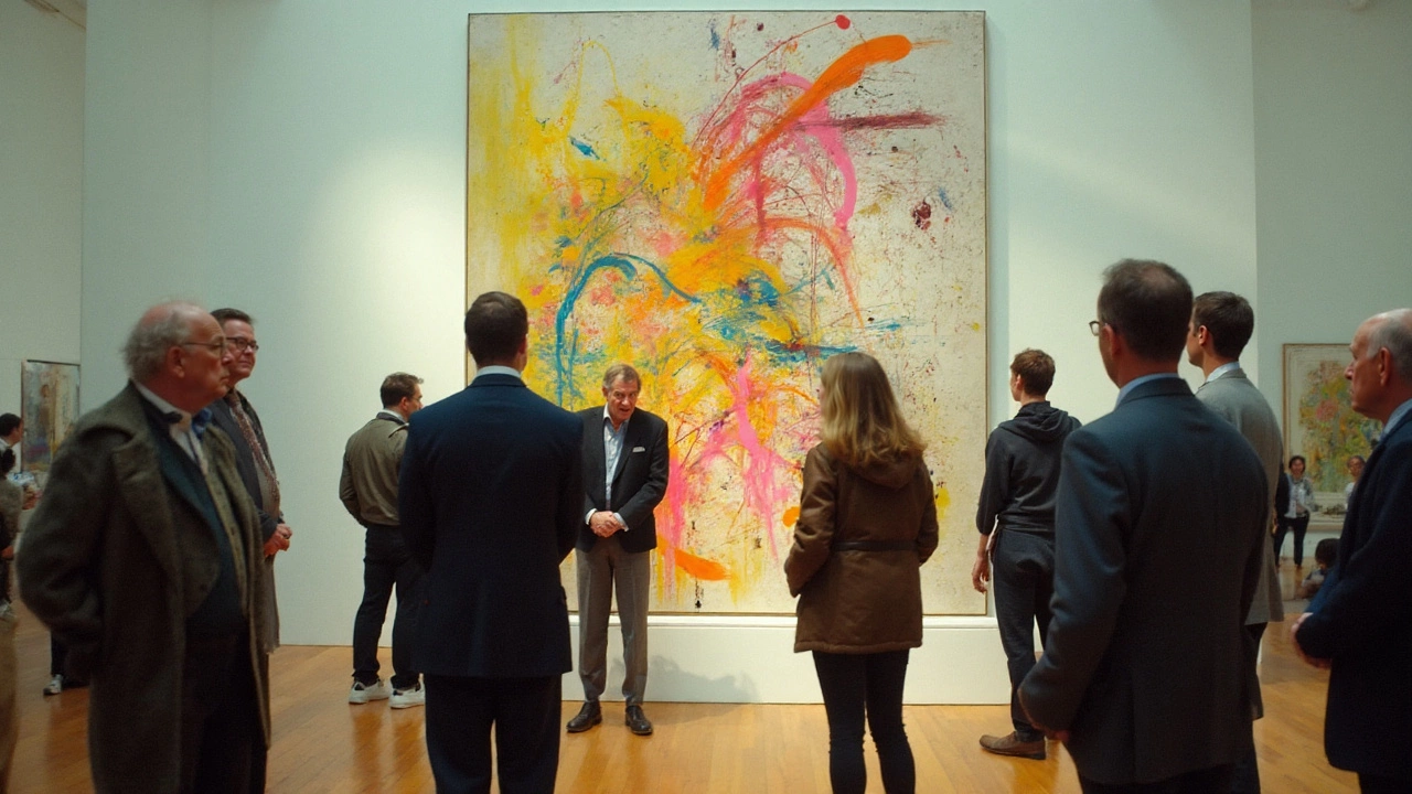
- Check structure. Abstraction still needs internal logic: composition, rhythm, contrast, and balance. Squint. Does the image hold? Step back. Does it collapse? Strong abstract pieces read at three distances: across the room, a few steps away, and nose‑to‑surface.
- Place it in a lineage. Which artists does this clearly descend from? Kandinsky, Mondrian, Rothko, Frankenthaler, Martin, Richter, Ryman, Riley, Serra, Scully, Benglis, Gilliam-there are many families. If the work is a clean echo of a well‑known style with no twist, that’s derivative, not dialogue.
- Test for consistency. Look at more than one piece. Is the quality steady? Does the artist’s language deepen across works, or is it one trick repeated?
- Demand evidence beyond the room. Shows, catalogs, residencies, critical writing-any signals that peers engage with the work. For a purchase, ask for provenance, condition notes, and price history. If the only pitch is “hot right now,” assume the opposite.
- Do the lived‑with test. If you’re a buyer, bring a mockup into your space or ask for a short home trial. Abstract work can shift with light and context. What felt serene in a gallery might turn lifeless in a living room.
- Calibrate your gut with time. Spend at least two full minutes in front of the piece. Most viewers bail far too early. Give it a fair shot, then trust your response.
Use this like a checklist. The more boxes you tick, the lower your risk-whether the risk is confusion, buyer’s remorse, or a dull studio practice.

Examples and evidence: when abstraction fails (and why)
All art forms have weaknesses. Abstraction just makes them obvious because it removes the safety net of recognizable subjects. Here are the pain points that show up again and again.
- Viewer friction. Without a figure, narrative, or place to latch onto, many people bounce. Museum timing studies show short attention spans. A classic study by J. K. Smith and L. F. Smith (Journal of Museum Education, 2001) found the average time spent per artwork was about 27 seconds. Abstraction rarely wins the race for snap attention unless scale or color does the heavy lifting.
- Skill camouflage. Process‑heavy works-pours, scrapes, sprayed gradients-can look impressive while masking weak decisions. Up close, you’ll see it: unresolved edges, muddy mixing, or default tool marks standing in for intention.
- Trend cycles. When a visual recipe becomes fashionable, copycats flood in. Critics dubbed a wave of mid‑2010s process painting “zombie formalism”: slick surfaces, quick auction flips, and thin ideas. Prices spiked, then sagged as the novelty wore off. The lesson isn’t “avoid abstraction.” It’s “avoid fashionable sameness.”
- Context fragility. Some abstract pieces collapse outside a white cube. The aura of a pristine gallery can mask scale problems, color clashes with ordinary interiors, or how fragile a surface is to touch and light.
- Teaching load. In classrooms, abstraction demands scaffolding-visual literacy, art history, and vocabulary for form and perception. Without that, students either mimic YouTube techniques or give up.
There’s also a basic psychology piece. People like what they can process easily. Psychologists R. Reber and N. Schwarz popularized “processing fluency” two decades ago: when images feel easier to parse, we tend to like them more. Abstraction can be fluent-think crisp Op Art-or it can be visually ambiguous. Either way, the burden is on the artist to reward the viewer’s effort.
“There is no abstract art. You must always start with something. Afterward you can remove all traces of reality.”
Picasso’s point still bites: abstraction isn’t a free pass; it’s a process of reduction. Remove too much and you risk emptiness. Remove the right things and you hit essence.
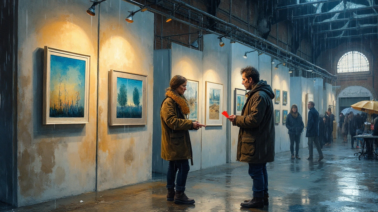
I live in Vancouver, where rain can turn the sky into one giant softbox. In local galleries, I see a pattern: large abstract canvases that sing in cool daylight turn flat under warm interior bulbs. That’s a practical disadvantage buyers discover late. Color temperature, wall tone, and even ceiling height make or break abstract work more than representational pieces, because form, texture, and scale carry so much of the message.
| Signal | Source | Key data point | Why it matters |
|---|---|---|---|
| Average time spent per artwork in museums | J. K. Smith & L. F. Smith, Journal of Museum Education (2001) | ≈27 seconds | Abstract works often need more than half a minute to “land.” Short attention hurts them. |
| Share of Post‑War & Contemporary in public auction sales (by value), 2023 | Art Basel & UBS Art Market Report 2024 | ≈50% | Market is big but volatile. Hype can move prices up fast-and down just as fast. |
| Viewer preference and fluency | Reber, Schwartz & Winkielman, Review of General Psychology (2004) | High processing fluency increases liking | Ambiguous abstraction risks low fluency; artists must supply other rewards (texture, color, rhythm). |
| Time-on-label effects in galleries | Exhibit timing research summarized by S. Bitgood (2013) | Interpretive aids increase dwell time | Abstract art often depends on labels or guides; without them, visitors move on quickly. |
These aren’t “gotchas”; they’re guardrails. If you make, teach, collect, or show abstract art, you’re working against short attention spans, fuzzy quality signals, and trend noise. Knowing that helps.
Checklists, heuristics, and tools you can use today
Use these quick tools to cut through the fog.
For viewers and students
- The 2-2-2 rule: Give the piece two minutes up close, two at mid‑range, two across the room. If nothing unfolds, move on guilt‑free.
- Three questions: What is the strongest choice here? What is the weakest? What would I miss if this disappeared?
- Find the engine: Is this work driven by color, texture, rhythm, space, or material behavior? If you can’t name an engine, the work is probably coasting.
For artists
- Ban the first idea: Your first composition in abstraction is usually a cliché. Generate five layouts before committing.
- Edge audit: Count and defend your edges: hard, soft, lost‑and‑found. Every edge should be a choice, not an accident.
- Material discipline: Limit the palette, tools, and gestures in a series. Constraint reveals intention.
- Distance test: Photograph the work at three distances. If the image dies in any one of them, adjust structure or contrast.
- Lexicon building: Keep a vocabulary of 10-20 moves that feel truly yours. Expand slowly; prune often.
For collectors and gallerists
- Three‑year filter: If a style exploded this year, ask how it looked three years ago and who is still building on it. Hype fades; rigor sticks.
- Provenance packet: Before buying: get images of the back, edges, and any condition issues; exhibition history; and a short text by the artist or curator. If none exists, ask why.
- Light and space mockups: Request a digital mockup with your actual wall color and lighting temperature (2700K vs 4000K matters). Many galleries will do this in an afternoon.
- Liquidity sanity check: If resale matters to you, look for representation stability (same gallery for 3+ years), inclusion in group shows and catalogs, and a price trajectory that isn’t doubling every season.
For educators
- Build scaffolds: Teach abstraction after units on composition, value, and color harmony. Give students tools, not a blank cliff.
- Reference maps: Pin a simple lineage map on the wall-Kandinsky → Gorky → de Kooning → Joan Mitchell → contemporary echoes. Students need roots to find their branch.
- Crit rules: Ban “I like/don’t like.” Use verbs and nouns: “The diagonal cuts the field,” “Texture fights the color,” “This passage resolves the chaos.”
Red flags that often signal weak abstraction
- “Statement” that only lists materials and buzzwords.
- Copy‑paste titles (“Untitled #128”) across wildly different works with no series logic.
- Surface that looks busy but says nothing up close.
- One‑trick textures: the same pour, scrape, or spray repeated to fill space.
- Scale mismatch: huge canvas for a small idea, or postage‑stamp size for a grand gesture.
Green flags that often track with strong abstraction
- Compositional decisions you can name: a tension line, a chromatic anchor, a breathing zone.
- Varied edges and transitions that guide the eye.
- Series thinking: the piece belongs to a family, not a lone experiment.
- Material mastery: clear evidence the artist shaped what the material did, not the other way around.

Mini‑FAQ and next steps
Is abstract art easier to make than figurative art?
Different hard. Abstraction removes the narrative scaffolding, so the choices must stand on their own. Many beginners find abstraction harder because mistakes have nowhere to hide.
Why do some abstract paintings sell for so much?
Pricing reflects reputation, rarity, and demand, not just the time or materials. In public auctions, Post‑War & Contemporary works (which include a lot of abstraction) account for about half of sales by value, according to the Art Basel & UBS Art Market Report 2024. Big names and museum‑level provenance drive big prices. That doesn’t guarantee staying power for every trend.
How do I explain abstract art to someone who “doesn’t get it”?
Skip theory. Try: “Don’t look for a picture; look for decisions. Follow the largest shape, the strongest color, and the oddest edge.” Then give them two minutes in silence. Most people find a way in-or they don’t, and that’s fine.
Does abstraction work better in large sizes?
Scale helps, but only if the idea warrants it. A weak composition gets louder, not better, when you inflate it. Great small abstract pieces exist; they just ask for closer viewing.
Can I buy abstract art online safely?
Yes-if you slow down. Request detail photos, video in raking light, condition notes, and a short return window. Do a wall‑color and lighting mockup. If the seller resists basic due diligence, pass.
Next steps for different goals
- Viewers/students: Pick three abstract artists from different lineages (e.g., Agnes Martin, Mark Bradford, Bridget Riley). Spend 10 minutes with each. Write what you notice, not what you feel. Feelings will follow.
- Artists: Set a 10‑piece series goal with one constraint (e.g., only two colors, only curved lines, only a drywall knife). Review with the edge audit and distance test.
- Collectors: Shortlist three galleries with a track record in abstraction. Ask each for two emerging artists they think will hold up in five years and why. Compare the answers, not the sales pitch.
- Educators: Build a one‑page “abstraction map” for your class and a crit rubric that bans “I like/dislike.” Watch the quality of feedback jump.
Abstract art isn’t the enemy. Blind spots are. If you name the disadvantages-meaning gaps, fuzzy quality signals, trend risk, context fragility-you can work around them. The payoff is real: when abstraction lands, it gives you pure form, color, rhythm, and space in a way no other mode can touch.


