Visual Path Checker for Landscape Paintings
Check Your Composition
Apply the article's first rule: Does your painting have a clear visual path? Answer the questions below to evaluate your composition.
When you look at a landscape painting that pulls you in-where the sky feels endless, the trees breathe, and the path leads somewhere you want to follow-it’s not luck. It’s not just pretty colors. It’s the first rule of landscaping in painting: establish a clear visual path. This isn’t about making a map. It’s about guiding the viewer’s eye so they don’t get lost, don’t feel confused, and don’t look away too soon.
Why the First Rule Matters More Than Color or Detail
Many beginners think landscape painting is about rendering every leaf, every ripple in the water, every shadow under a rock. But if you do that without direction, your painting becomes a mess. Think of it like walking into a forest with no trail. You see beauty everywhere, but you don’t know where to go. That’s what a bad landscape feels like.
The first rule fixes that. It says: lead the eye. You don’t need to paint everything. You need to show the viewer where to look first, then second, then third. A strong path doesn’t mean a straight line. It can be a curve, a diagonal, a ripple of light, even the angle of a fence. But it must be unmistakable.
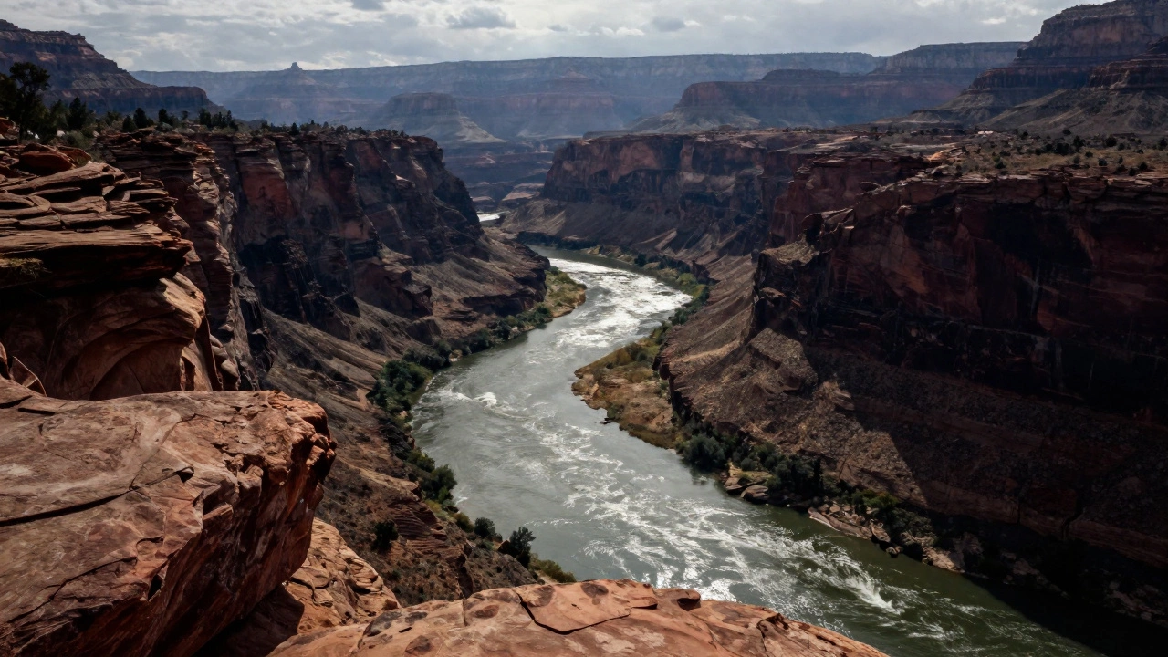
Take Thomas Moran’s The Grand Canyon of the Yellowstone. The river doesn’t just flow-it pulls your gaze from the foreground rocks, up the canyon walls, and into the misty distance. That’s the first rule in action. Not because the colors are vivid (though they are), but because every brushstroke supports a single journey.
How to Build a Visual Path in Your Painting
Here’s how to build that path without overthinking it:
- Start with your focal point. Where do you want the viewer to land? A cabin? A distant mountain? A single tree? Pick one.
- Use lines-real or implied-to point toward it. A winding road, the edge of a field, the tilt of branches, even the direction of shadows can act as arrows.
- Make sure your path begins in the foreground. If your eye has nowhere to enter the painting, it won’t stay. A rock, a patch of grass, a figure walking-something close, something tangible.
- Let light do the work. Bright areas attract attention. Use subtle gradients: darker near the edges, lighter near your focal point. It’s like spotlighting on a stage.
- Remove distractions. If you paint five identical trees in the background, your eye bounces between them. Paint one strong one, blur the rest. Less is more.
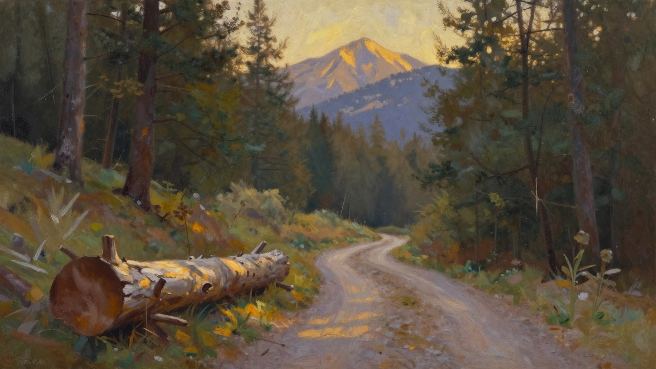
One painter I know in Vancouver-she paints coastal scenes-always starts with a single fallen log. She paints it with sharp detail, then lets the rest of the scene fade into soft washes. The log isn’t the subject. It’s the doorway. Once you look at the log, your eye slides naturally to the tide, then the cliffs, then the sky. That’s the rule.
What Happens When You Ignore It
I’ve seen too many paintings where everything is equally detailed. The foreground has every blade of grass. The middle ground has a perfectly rendered barn. The background has a mountain range with individual snow patches. The result? A flat, lifeless image. Your eyes don’t know where to rest. You scan, you blink, you move on.
This happens because the painter didn’t decide where to look first. They painted what they saw, not what they wanted you to feel. A landscape isn’t a photo. It’s a story. And stories need a beginning, a middle, and a clear direction.
Even Monet, who painted light and atmosphere more than structure, never ignored this. In Water Lilies, the reflections don’t float randomly. They follow the curve of the pond, pulling you deeper into the water. The lilies aren’t just dots-they’re stepping stones along a visual trail.
Common Mistakes and How to Fix Them
Here are the three most common mistakes painters make when trying to apply this rule:
- Mistake: Putting the focal point dead center. Fix: Use the rule of thirds. Place your main subject slightly off-center. It creates tension-and tension keeps the eye moving.
- Mistake: Using too many competing lines. Fix: Pick one leading line and stick with it. If you have a path, don’t also have a fence, a river, and a row of trees all pointing in different directions.
- Mistake: Making the foreground too empty. Fix: Add something small but solid near the bottom edge. A rock, a boot, a patch of moss. It grounds the painting and gives the eye a place to start.
Try this exercise: Take any landscape photo you like. Draw three lines from the bottom edge of the image toward the center. One line should lead to your main subject. The other two should gently guide the eye toward it from the sides. If you can’t draw those lines, your composition needs work.
It’s Not About Realism-It’s About Feeling
You don’t need to paint a perfect mountain to make someone feel like they’re standing on a ridge. You just need to make them feel like they’re being led there.
That’s why abstract landscape painters like Agnes Martin or even early Georgia O’Keeffe still follow this rule. Their lines aren’t literal roads, but they still pull you. Their colors aren’t realistic skies, but they still guide you upward. The first rule isn’t about copying nature. It’s about honoring how the human eye moves through space.
When you paint a landscape, you’re not just recording what’s out there. You’re inviting someone into a moment. And moments need direction. Without it, they’re just noise.
Practice Exercise: The One-Path Challenge
Next time you paint a landscape, give yourself this rule: Only one clear path leads through the whole scene.
- Use no more than three elements to create that path.
- Let everything else recede-soft edges, muted tones, less detail.
- Paint the focal point with the most contrast and the sharpest edges.
- Step back after 15 minutes. Can you trace your eye’s journey in one smooth motion? If not, simplify.
It’s not about perfection. It’s about clarity. And once you get it, your paintings will stop looking like decorations-and start feeling like invitations.
What is the first rule of landscaping in painting?
The first rule of landscaping in painting is to establish a clear visual path that guides the viewer’s eye through the scene. This path starts in the foreground, leads toward a focal point, and uses lines, light, and contrast to create movement. It’s not about realism-it’s about directing attention so the painting feels intentional and engaging.
Why is composition more important than detail in landscape painting?
Detail without direction confuses the viewer. If every part of the painting is equally sharp and colorful, the eye has nowhere to rest. Composition creates rhythm and purpose. A simple path with one strong focal point will always feel more powerful than a crowded, detailed scene without focus.
Can abstract landscape paintings follow the first rule?
Yes. Abstract landscapes don’t need trees or rivers to guide the eye. They use color gradients, directional brushstrokes, and value contrasts to create movement. Agnes Martin’s subtle horizontal lines or O’Keeffe’s curved horizons still lead the viewer-just not with literal objects. The rule is about flow, not realism.
How do I avoid making my landscape look flat?
Use depth cues: a clear foreground element to start the eye’s journey, midground elements that are slightly softer, and a background that’s lighter and less detailed. Light also helps-brighter areas draw attention, while darker edges push the eye inward. Contrast in value, not just color, creates dimension.
Do I need to paint everything I see in nature?
No. In fact, painting everything usually makes the image weaker. Good landscape painting is selective. You choose what to include and what to leave out. The goal isn’t to copy nature-it’s to recreate the feeling of being there. That means simplifying, emphasizing, and guiding-not documenting.