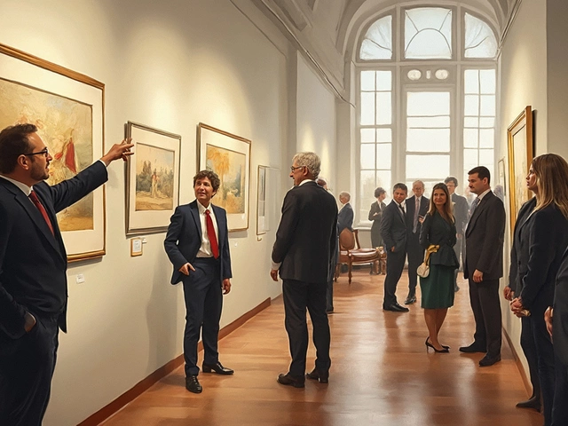
Landscape Depth Simulator
Select a zone below to see how it contributes to the illusion of depth in a landscape painting.
Foreground
Role: Anchor the viewer's eye.
Technique: Use sharp edges, high contrast, and rich colors. This is where you place leading lines like paths or riverbanks to guide the eye into the scene.
You stare at a canvas. It’s beautiful, sure, but something feels flat. The trees look like cutouts pasted onto the sky. The river doesn’t seem to flow away from you; it just sits there. This is usually because the artist forgot one crucial thing: a landscape isn't just a picture of nature. It's a constructed space with depth.
Most beginners think they need better brushes or more expensive paint to fix this. They don’t. They need to understand structure. Every convincing landscape, whether it’s a watercolor of the Pacific Northwest or an oil painting of the Alps, relies on four distinct parts working together. If you get these right, your paintings instantly gain three-dimensional weight. If you ignore them, you’re just coloring inside the lines of a flat map.
Why Structure Matters More Than Color
Think about how you actually see the world. You don’t see everything at once with equal clarity. Your eyes naturally prioritize what is close, then what is far. Landscape composition is simply the act of translating that visual hierarchy onto a flat surface. When artists talk about the "four parts," they are referring to the spatial zones that create this illusion of distance.
This isn't just theory. It’s physics and psychology combined. Light scatters as it travels through the atmosphere. Objects further away lose contrast and saturation. By dividing your canvas into specific zones, you give yourself a roadmap for applying these physical rules. You stop guessing where to put dark shadows and start placing them where logic demands they belong.
The Four Essential Zones
While some complex scenes might have subtle transitions, every standard landscape breaks down into four primary layers. Mastering these is the fastest way to improve your spatial awareness.
- Foreground: The area closest to the viewer, occupying the bottom third of the canvas.
- Middle Ground: The central zone containing the main subject matter.
- Background: The distant elements, including mountains, forests, or city skylines.
- Sky: The upper portion that sets the mood and light source.
Wait, why is the sky a separate part? Because in traditional landscape theory, the sky isn't just "space above." It interacts with the land. It reflects off water. It casts shadows. Treating it as a fourth structural pillar ensures you balance the top of your painting against the bottom. Without a strong sky, your landscape feels heavy and grounded, lacking airiness.
Mastering the Foreground
The foreground is your anchor. It’s the first thing the viewer sees, so it needs detail and texture. Think of it as the hook. If your foreground is empty or vague, the eye slides right off the painting.
In practice, this means using larger brushstrokes and higher contrast. If you’re painting grass, show individual blades. If it’s rocks, show their cracks. Why? Because we see nearby objects clearly. Our eyes resolve fine details up close. If you blur the foreground, you confuse the brain. It thinks, "This should be close, but it looks far." That disconnect kills immersion.
A common mistake here is overcrowding. Beginners often dump too many rocks, flowers, and roots into the bottom corner. Keep it simple but sharp. One interesting rock formation with clear shadow work beats twenty indistinct pebbles. Use the foreground to lead the eye inward. Place a path, a riverbank, or a fence post that points toward the middle ground. This creates a visual journey rather than a static snapshot.
Navigating the Middle Ground
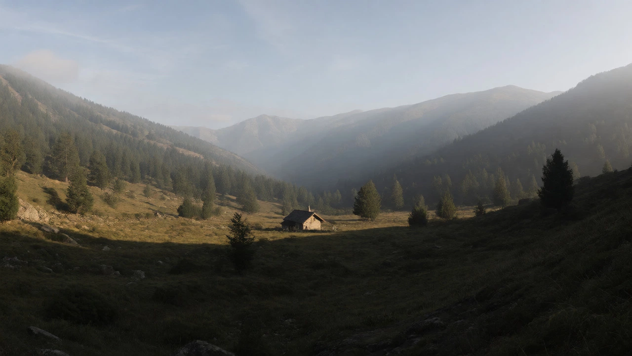
The middle ground is where the story happens. This is typically the largest section of the canvas and contains the focal point-the cabin, the tree, the figure walking. Unlike the foreground, you can soften edges slightly here. You don’t need to paint every leaf on a mid-distance tree. Instead, focus on shapes and values.
Contrast drops significantly compared to the foreground. Shadows become softer. Colors remain relatively true but start losing their punch. This zone bridges the gap between the immediate reality of the front and the atmospheric haze of the back. If your middle ground lacks definition, the painting feels disjointed. The foreground floats away from the background. To fix this, ensure there is a logical connection. Maybe the light hits the middle-ground tree directly, creating a bright spot that contrasts with the darker foreground rocks.
Consider the concept of atmospheric perspective. As you move from foreground to middle ground, you introduce less detail but maintain solid forms. This requires restraint. It’s tempting to keep adding detail, but remember: distance equals simplification.
Creating Depth in the Background
The background is all about suggestion. You aren’t painting facts anymore; you’re painting impressions. Mountains, distant hills, or far-off buildings should lack hard edges. Their colors shift toward blue or gray due to Rayleigh scattering-the same reason the sky is blue. Air particles scatter shorter wavelengths (blue) more than longer ones (red), making distant objects appear cooler and lighter.
Do not use pure black or deep shadows in the background. They will pop forward and ruin the illusion of distance. Instead, mix your blues with white or a touch of yellow to match the sky’s tone. Values compress here. The difference between light and dark areas shrinks. A mountain range shouldn’t have stark black valleys unless there’s a storm rolling in. Generally, keep it soft, hazy, and cool.
If you’re painting a coastal scene, the background might be the ocean meeting the horizon. Here, texture disappears entirely. The water becomes a smooth gradient. This absence of detail signals to the viewer’s brain: "This is very far away." Trust that signal. Don’t overwork it.

The Role of the Sky and Horizon Line
The sky dictates the lighting conditions for the entire piece. Is it a sunny noon? Overcast dusk? Stormy afternoon? The sky tells the viewer when and where they are standing. It also balances the composition. If you have a heavy, dark foreground, you need a lighter, open sky to prevent the painting from feeling claustrophobic.
The horizon line is the boundary between earth and sky. Its placement changes the emotional impact of the work. Placing the horizon low (in the lower third) emphasizes the sky, creating a sense of openness and grandeur. Placing it high (in the upper third) focuses attention on the land, making the terrain feel dominant and imposing.
Never place the horizon exactly in the center unless you want a very specific, symmetrical effect. It usually looks static. Off-center horizons create dynamic tension. Also, remember that the horizon isn’t always straight. In mountainous regions, it’s jagged. In coastal areas, it’s curved by the earth’s shape. Respect the geometry of the location.
Putting It All Together: A Checklist
Before you call a painting finished, run through this diagnostic check. It helps catch structural errors before they become habits.
| Zone | Detail Level | Color Saturation | Value Contrast |
|---|---|---|---|
| Foreground | High | High | High |
| Middle Ground | Medium | Medium | Medium |
| Background | Low | Low (Cooler) | Low |
| Sky | Variable | Contextual | Light Source |
If your background has the same contrast as your foreground, you’ve made a mistake. Step back. Squint. What do you see? If everything blurs into one mass, you need to adjust your values. Darken the foreground slightly or lighten the background. Create separation.
Common Pitfalls to Avoid
One major error is ignoring the transition zones. The shift from middle to background shouldn’t be abrupt. Use overlapping shapes to blend them. A distant tree partially obscuring a hill helps merge the layers. Another issue is inconsistent lighting. If the sun is behind the clouds in the sky, why is the foreground brightly lit? Ensure the light direction matches across all four parts.
Also, watch out for "floating" elements. If a boat in the middle ground doesn’t have a reflection or a shadow connecting it to the water, it looks like a sticker. Ground your subjects. Connect them to their environment through cast shadows or reflections. This ties the four parts into a cohesive whole.
Do I always need all four parts?
Not necessarily. Some abstract landscapes or extreme close-ups might omit the background or sky. However, for realistic representational art, having at least three distinct planes (usually foreground, middle ground, and sky/background) is essential for creating depth. Omitting one requires a deliberate artistic choice, not an oversight.
How do I handle foggy or misty landscapes?
Fog accelerates atmospheric perspective. Details disappear faster. In a misty scene, the middle ground might look almost like the background. Reduce contrast drastically in the middle ground and push colors toward the color of the mist (often white or pale blue). The foreground may still retain some detail if the fog is thin near the ground, but generally, everything loses saturation and edge definition.
What if my horizon line is hidden by trees?
If the horizon is obscured, the sky still plays a role in lighting and mood. You can imply the horizon through the tops of distant trees or the vanishing point of roads and rivers. The structural principle remains: you need a sense of receding space. Even without a visible line, the background elements must appear further away than the foreground ones through size reduction and value compression.
Can I break these rules?
Absolutely. Expressionists and modern artists often flatten space intentionally. They might use uniform detail throughout or ignore atmospheric perspective to emphasize pattern or emotion. But you should break the rules consciously, knowing why you’re doing it. Understand the traditional four-part structure first, then decide which part to distort for effect.
Does this apply to digital art too?
Yes, completely. Digital tools make it easier to manage layers, which corresponds directly to the four parts. Many digital painters literally separate their foreground, middle ground, and background into different layers. The principles of value, saturation, and detail reduction remain identical regardless of the medium-whether you use oils, acrylics, watercolors, or Photoshop.