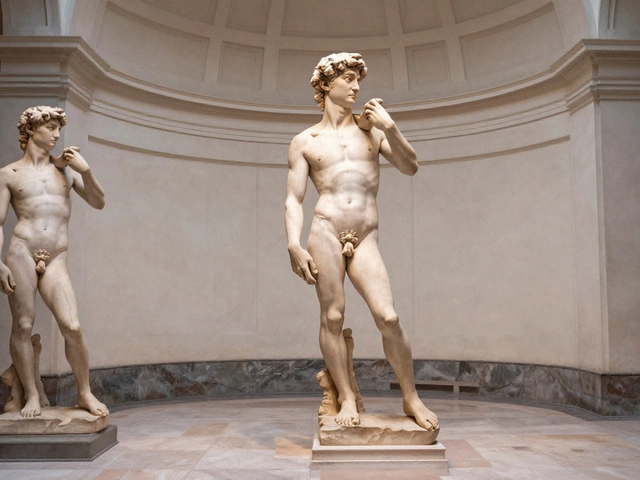
Romantic landscape paintings aren’t just pretty views—they tap into deep emotions. Ever get chills looking at mountains rising through mist or a thunderstorm tearing across the sky? Artists in the Romantic era found ways to crank these feelings up, turning nature into something almost larger than life.
If you want to tell what kind of Romantic landscape you’re looking at, start by checking how the artist presents nature. Is it wild and overwhelming, or soft and almost storybook-like? These clues say a lot about what the artist wants you to feel—and why landscape painting got so popular back in the 1800s. Knowing the two types will help you see more than just trees and clouds next time you look at art.
- What Makes a Landscape Painting Romantic?
- The Sublime: Nature’s Drama and Awe
- The Picturesque: Calm Beauty and Escapism
- Spotting the Difference and Picking Your Favorite
What Makes a Landscape Painting Romantic?
When someone talks about romantic landscape paintings, they don’t mean paint that’s all about candles and roses. Romanticism in art popped up in the late 1700s as a big reaction against hard-edged rules and logic. Instead, it’s all about feeling things deeply. A Romantic landscape painting wants you to feel small standing next to a thundering waterfall, or peaceful in a sun-soaked valley.
Artists like Caspar David Friedrich and J.M.W. Turner led the way by cranking up emotion using nature. They’d throw a tiny human figure into a huge wilderness or make clouds twist dramatically over farmland. There’s usually a focus on untamed nature, glowing colors, and wild weather—stuff that makes you say, "Wow." If a painting makes you want to jump into the scene or just stare at it in awe, that’s a key sign it’s in this style.
The main difference is emotional punch. Where older landscape art showed nature as neat and tidy, Romantic landscapes go for drama or calm with an edge. Here’s what usually shows up:
- Big, moody skies and sunsets
- Mist, clouds, or storms
- Wild forests, jagged mountains, crashing waves
- Tiny people or animals lost in massive scenes
- Hints of mystery, isolation, or adventure
Check out these classic Romantic artists and their approach to landscape paintings:
| Artist | Known For |
|---|---|
| J.M.W. Turner | Epic seascapes, wild weather, sunlight |
| Caspar David Friedrich | Lonely figures, foggy mountains, spiritual feel |
| Thomas Cole | Vast American scenes, sense of discovery |
So if a landscape grabs you by the feelings—either with drama or dreamy calm—you’re probably looking at a Romantic take. These painters wanted viewers to forget rules and just feel the power of nature, straight up.
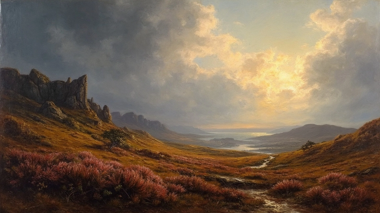
The Sublime: Nature’s Drama and Awe
If a landscape makes your jaw drop because of its crazy, wild energy, you’re probably looking at a painting of romantic landscape paintings in the sublime style. The whole idea behind 'the sublime' is showing nature as powerful, sometimes dangerous, and way bigger than anything humans can handle. It’s about awe and even a little fear. Think roaring waterfalls, lightning storms, or a ship barely hanging on during huge waves.
One of the best-known examples? Caspar David Friedrich’s “Wanderer above the Sea of Fog.” You’ve got one guy, tiny against a rolling sea of clouds, with steep cliffs all around. Turner's paintings, like “Snow Storm: Hannibal and his Army Crossing the Alps,” show blizzards and swirling winds that almost swallow people and animals up. Both use wild, dramatic scenery and moody lighting to make you feel small compared to nature.
Here’s what sets these romantic landscape paintings apart:
- Powerful contrasts—lots of dark shadows against flashes of light
- Extreme weather and rugged, untamed land
- Tiny human figures (if any) to show how huge and intense nature can be
- Twisting trees, craggy rocks, wild skies—anything that feels raw or overwhelming
The fun thing is, these paintings weren’t just about showing off painting skills. They were saying something: nature isn’t a nice, friendly background; it’s a force. Painters like Friedrich, Turner, and Thomas Cole wanted viewers to feel wonder, but also respect for nature’s power.
Why does this matter? Because the sublime isn’t just about looks. It’s about the feeling you get—admiration mixed with a hint of fear. Once you notice it, you can spot these intense scenes in tons of romantic landscape paintings from the early 1800s. You’ll find them in big museums and even on some modern album covers.
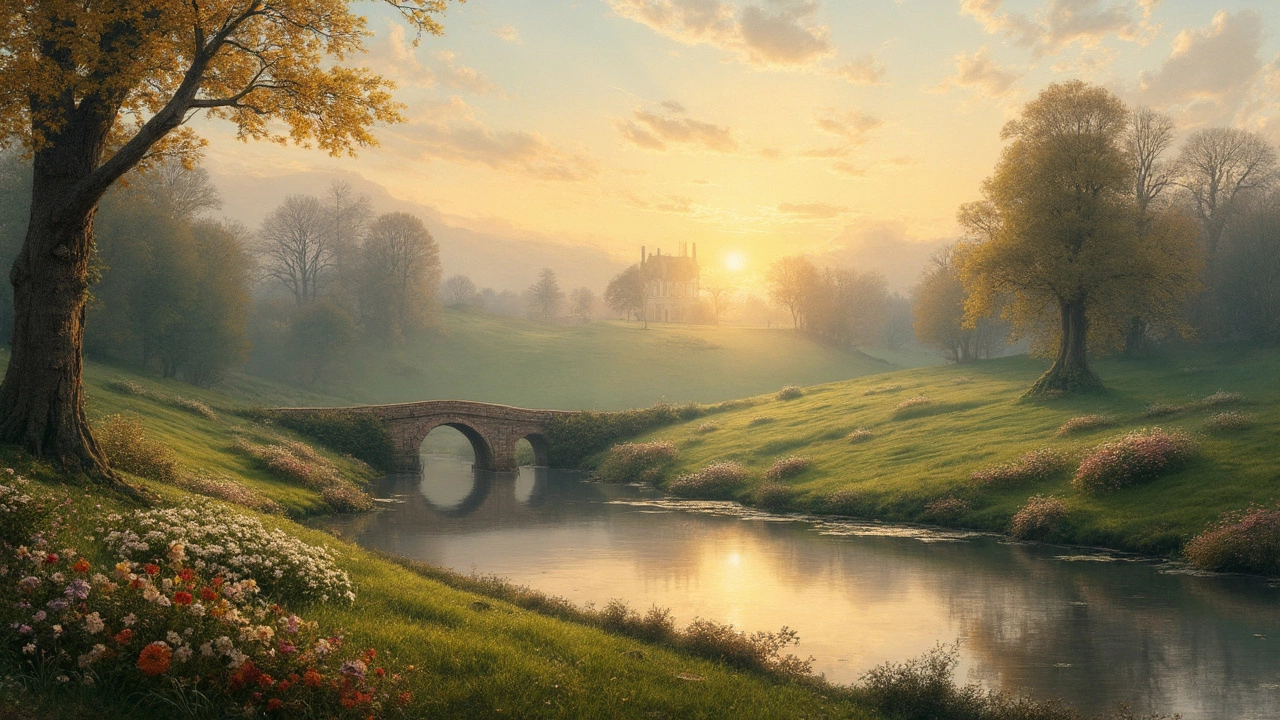
The Picturesque: Calm Beauty and Escapism
When you hear "picturesque" in the world of romantic landscape paintings, think scenes you'd want to step into or hang over your couch. The picturesque is all about calm, inviting settings that look tidy but still natural—nothing too wild or scary here.
This style goes back to the late 1700s and early 1800s, right when artists and travelers in Europe, especially England, started craving a break from hectic city life. They found their escape through quiet valleys, rolling fields, cozy cottages, and twisting paths. Painters like Thomas Gainsborough and John Constable loved these gentle scenes, showing real villages, patches of sunlight, and a kind of everyday peace.
Painters in the picturesque camp used a few tricks to give their art that soft, relaxed vibe:
- Balanced layouts: They often framed scenes with trees or buildings on the sides, almost like they’re inviting you in.
- Warm, gentle light: Cozy morning or evening sun made everything look peaceful and safe.
- People and animals: You’ll often spot shepherds, cows, or families, which add a lived-in feel to the landscape.
One tip: if you spot a painting where everything seems arranged “just right” (think a perfect picnic spot) but it still feels believable, you’re probably looking at the picturesque type. Even the term “picturesque” came from how people back then ranked views—some landscapes were “too wild,” while others had just the right mix of beauty, variety, and calm.
Why did people love this so much? Basically, it was a mental vacation. Landscapes like these offered a great escape from city crowds and grime. Even today, these scenes are still popular because who doesn’t crave a moment of peace?
| Artist | Famous Picturesque Work | Year |
|---|---|---|
| John Constable | The Hay Wain | 1821 |
| Thomas Gainsborough | Mr. and Mrs. Andrews | 1750 |
| Claude Lorrain | Landscape with Cattle and Peasants | 1629 |
If you’re picking art for your home or just want a visual break, picturesque landscape paintings never really go out of style. Look out for these signs next time you browse an art gallery or online store—they’re easier to spot once you know what to look for.
Spotting the Difference and Picking Your Favorite
If you're staring at a painting and trying to figure out if it's the sublime or the picturesque side of romantic landscape paintings, start by asking yourself: does it make you feel tiny or totally relaxed? Sublime landscapes (think of artists like Caspar David Friedrich or J.M.W. Turner) usually show wild mountains, crashing waves, or wild storms—stuff that looks dangerous or overwhelming. These paintings use crazy contrasts in light and shadow, and you’ll often see tiny people in huge, epic settings. The whole point is to make you feel awe—maybe even a little afraid in a good way.
On the other hand, the picturesque type (popular with folks like John Constable or Thomas Cole) centers on scenes that feel friendly, calm, and a bit like the perfect picnic spot. Think gentle hills, peaceful lakes, tidy villages, and those fluffy clouds. The color palette is softer. Everything looks balanced and safe. It’s less about power, more about chill vibes and beauty. The British even had huge debates in the 1800s about what made a view ‘picturesque’—they took it so seriously, some people wrote entire books about it!
Here’s a quick way to compare:
- Sublime: Big scenes, rough weather, high drama, strong contrasts, small humans.
- Picturesque: Cozy scenes, calm vibe, soft colors, balanced composition, relatable scale.
If you want to get better at spotting which type you prefer, try this: go to a museum website and pull up, say, Friedrich’s “Wanderer above the Sea of Fog” for the sublime, and Constable’s “The Hay Wain” for the picturesque. Notice your gut reaction. Do you get a rush from the wild and unpredictable, or do you long to step right into the calm and comfort?
Picking a favorite isn't about what's 'better'—it’s more about what hits your own nerves. If you love adventure movies or extreme sports, odds are you’ll be drawn to sublime landscapes. If Sunday strolls and quiet moments are more your thing, the picturesque will probably win you over.
| Type | Famous Artist | Iconic Painting |
|---|---|---|
| Sublime | Caspar David Friedrich | Wanderer above the Sea of Fog |
| Picturesque | John Constable | The Hay Wain |
So next time you’re scrolling through art or walking a gallery, see if you can spot the difference. It makes the whole experience more rewarding, and who knows—maybe you’ll find a new favorite style to look for!