Best Paper for Watercolor: What Works and Why
When you're painting with watercolor, the best paper for watercolor, a surface designed to handle wet pigment without warping or bleeding. It's not just paper—it's the foundation that decides if your washes glow or turn muddy. Most people think any thick paper will do, but that’s where things go wrong. Watercolor paper has three key traits: weight, texture, and sizing. Weight is measured in pounds (lb) or grams per square meter (gsm). If you’re using a lot of water, go for 300 lb (640 gsm) or higher. Anything lighter than 140 lb will buckle like a wet napkin, no matter how much you tape it down.
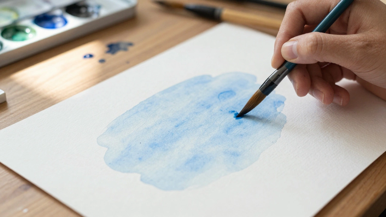
The texture matters more than you think. Cold press is the most popular—it has a slight bump that holds pigment nicely and gives you control over washes. Hot press is smooth, great for fine details like portraits or botanicals. Rough paper? It’s got deep valleys that catch paint in wild, organic ways—perfect for landscapes with lots of texture. And sizing? That’s the internal coating that keeps water from soaking in too fast. Poor sizing means your colors bleed uncontrollably and your brush strokes turn sloppy.
You don’t need the most expensive paper to start, but cheap paper will waste your time. Brands like Arches, Fabriano, and Saunders Waterford are trusted for good reason—they hold up under multiple layers and don’t pill when you lift color. If you’re testing, buy a pad of 300 lb cold press. It’s the sweet spot for beginners and pros alike. And if you’re layering washes (which you should be), the right paper lets you build depth without turning everything into mud.
It’s not just about the paper—it’s about how you use it. Layering watercolor works because the paper breathes. It lets each wash dry before the next one sits on top, creating luminous layers. If your paper can’t handle that, you’ll end up with flat, lifeless paintings. The same goes for lifting color to correct mistakes or create highlights. Only good paper lets you do that cleanly.
Some artists swear by block paper—sheets glued on all four sides so they don’t warp at all. Others prefer loose sheets stretched on a board. Both work. The point is, your paper should never be the problem. It should disappear behind your colors, letting your vision come through without fighting the surface.
Below, you’ll find real advice from artists who’ve been there—what paper they use, what they avoid, and how they make even the simplest subjects look alive. No theory. No hype. Just what actually works on the table, in the studio, and under the light.