How to Blur Oil Painting Edges: Easy Techniques for Soft Transitions
Want buttery smooth blends in your oil paintings? Learn clever ways to blur edges, avoid harsh lines, and get those dreamy, professional soft transitions.
Ever noticed how a painting can guide your eye without a harsh line? That’s the power of a soft transition. It’s the subtle shift between colors, shapes, or textures that keeps a piece feeling natural and inviting. Below you’ll find straight‑forward tricks you can start using right now, no matter if you work with paint, digital tools, or a camera.
When a transition is too abrupt, the viewer’s attention snaps, breaking the mood you’re trying to create. A gentle fade, on the other hand, blends elements together and makes the whole composition feel cohesive. In photography, this can mean smoother background blur; in sculpture, it can be a gradual change in material density; in graphic design, it’s a clean gradient that guides the eye.
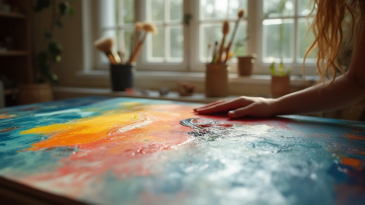
Painting: Start with a wet‑on‑wet technique. Lay down a base color, then, while it’s still damp, add a second hue and blend with a soft brush. If you’re working dry, use a dry‑brush method—lightly sweep a dry brush over the edge where two colors meet to feather the line.
Digital Art: Use the opacity slider on your brush to build color gradually. Most software also offers a ‘soft brush’ preset that automatically creates a feathered edge. When creating gradients, set the transition type to ‘linear’ or ‘radial’ and adjust the stop points until the shift feels natural.
Photography: Shoot during the golden hour; the natural light already provides soft transitions between highlights and shadows. If you need to soften a harsh edge in post‑production, apply a subtle Gaussian blur to the boundary area rather than the whole image.
Sculpture: Choose materials that allow for gradual texture changes, like clay that can be smoothed with tools. When moving from a smooth form to a rough surface, sculpt the transition area first, then refine it slowly, checking the overall silhouette as you go.
Graphic Design: When pairing fonts, use a slight size or weight change rather than a stark switch. For color palettes, pick adjacent hues on the color wheel and apply a gradient overlay to blend them seamlessly.
Across all these mediums, the key is patience. Take a moment to step back, look at the edge you’re working on, and ask if it feels harsh. If it does, lighten your touch, add a bit more medium, or adjust the opacity until the change feels like a whisper, not a shout.
One quick cheat‑sheet: whenever you’re unsure, add a middle tone between the two main colors. This “bridge” color acts like a ramp, making the transition easier to see and control.
Finally, don’t forget to test your work on different displays or lighting conditions. What looks soft on your screen might appear harsher under bright light. Adjust accordingly by tweaking the blend or adding another layer of subtle transition.
Soft transitions aren’t a magic trick; they’re just a habit of slowly easing from one element to another. Keep practicing these simple steps, and you’ll notice your art feels more cohesive, inviting, and professional.
Want buttery smooth blends in your oil paintings? Learn clever ways to blur edges, avoid harsh lines, and get those dreamy, professional soft transitions.