Rule of Thirds: Easy Ways to Boost Your Visuals
Ever wonder why some pictures just click while others feel flat? Chances are the winning ones follow a simple grid called the rule of thirds. It’s not a fancy theory – it’s a shortcut that helps you place the important parts of your image where people naturally look.
Why the Rule of Thirds Works
The human eye likes to wander across a scene, not stare at the dead center. Split your canvas into three equal columns and three equal rows. The four points where the lines intersect are called power points. Putting a subject on one of those spots adds balance and makes the piece feel more dynamic.
Research on eye‑tracking shows people spend more time looking at objects placed off‑center, especially at the intersections. That extra time translates into stronger interest, whether you’re showing a portrait, a landscape, or a product shot.
How to Apply It in Different Media
Photography: Turn on the grid overlay on your phone or camera. When you frame a shot, line up the horizon on the top or bottom third instead of the middle. If you’re shooting a person, place their eyes near the top‑left or top‑right intersection. This tiny tweak instantly adds depth.
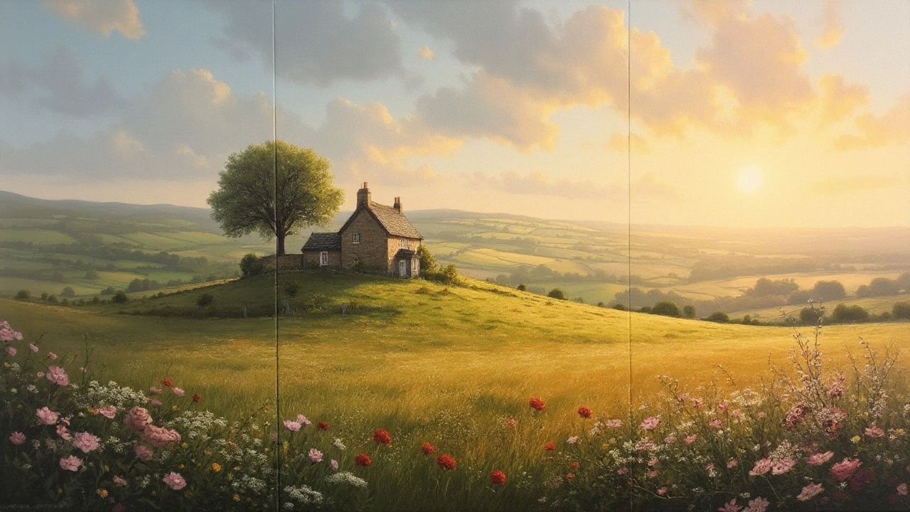
Painting & Drawing: Sketch a faint 3‑by‑3 grid before you start. Move the focal element – a tree, a figure, a light source – to a power point. You’ll notice the composition feels more lively, and the surrounding space gets a natural flow.
Graphic Design: Use the grid for layouts like flyers or web banners. Position headlines or call‑to‑action buttons on a third line to guide the reader’s eye. It creates a clear visual hierarchy without extra arrows.
Remember, the rule isn’t a law. It’s a starting point. Once you’re comfortable, you can break it on purpose for drama. For example, centering a symmetric building can create a powerful, formal vibe.
Common mistakes to avoid: placing everything on the grid lines and forgetting the surrounding negative space, or crowding all elements into one power point. Keep balance by leaving room for the eye to breathe.
To test the rule, take a favorite photo and crop it so the subject moves from the center to a power point. Notice how the same scene feels more engaging. Do the same with a sketch – you’ll see why many professionals swear by this simple guide.Bottom line: The rule of thirds is a quick, free tool that works across photography, painting, and design. Use it, experiment, and decide when it helps and when breaking it makes a stronger statement.